How to Get Started With Watch Face Customization on Apple Watch |
- How to Get Started With Watch Face Customization on Apple Watch
- How to Use Dark Mode on Kindle
- Alienware AW2721D 27″ Gaming Monitor Review
- How to Transfer Your iCloud Photo Library to Google Photos
- What Are Android Notification Channels?
- How to Cancel Your Paramount+ Subscription
| How to Get Started With Watch Face Customization on Apple Watch Posted: 05 Mar 2021 07:28 AM PST  The watch face is the window into the Apple Watch. It's not only how you tell the time, but also how you interact with complications (widgets) and apps. Here's how to get started with watch face customization on Apple Watch. Add a Watch Face on Apple WatchIt all starts with a new watch face on the Apple Watch. If you're bored with the pre-installed watch faces on the Apple Watch, you'll be happy to learn that there are some really cool watch faces just a couple of taps away. You can have something playful like the Mickey Mouse watch face, something super utilitarian like the Infograph watch face (with eight complications), or something that's unique to you using the Memoji watch face.
To add a new watch face, first, tap and hold the current watch face on your Apple Watch. From the watch face editing screen, swipe left to go to the end of the row. Here, tap the "+" button.
You will now see a vertically scrolling list of all available watch faces. Scroll through the list and tap a watch face to add it to your collection.
You can go back and add more watch faces as well. RELATED: How to Add a Watch Face on Apple Watch Change Watch Faces on Apple WatchOnce you start adding new watch faces, you might want a faster method of switching between them. It's actually quite easy. Just swipe in from the left or right edge of the Apple Watch's screen all the way to the other edge of the screen.
And that's it, a super quick way to switch between watch faces. Customize the Look of Watch Faces on Apple WatchThere are a couple of watch faces that completely transform themselves once you start customizing them. The Typograph watch face is a prime example. You can change the background colors, hour markers, and symbols. To customize the look of a watch face, tap and hold the watch face, then tap the "Edit" button.
Here, go through the "Dial," "Style," and other sections to change the look of the watch face. Scroll using the Digital Crown to try out different options.
Once you're happy, press the Digital Crown to save your custom style.
RELATED: How to Customize the Look of Watch Faces on Apple Watch Add Complications to Watch Faces on Apple WatchWhat sets the Apple Watch apart from other smartwatches is its huge collection of supported apps and complications. Each app can supply multiple complications (in different styles) to your watch face. If you choose a watch face like Infograph, you can have up to eight complications that can show you update-to-date data or act as shortcuts for actions, apps, or shortcut automations. To add complications to a watch face, simply press and hold the watch face that you want to customize, then tap the "Edit" button.
Now, swipe left until you end up in the "Complications" section. Each complication will now be highlighted. Simply tap a complication to change it. You can now see a list of all available complications. Select a complication that you want to add to the watch face.
The complication can be previewed in real-time. Repeat this process for all complications on the watch face. Once you're done, press the Digital Crown to save your complications.
RELATED: How to Add Complications to Your Watch Face on Apple Watch Reorder Watch Faces on Apple WatchOnce you're done trying out all the awesome watch faces on the Apple Watch, you might end up with three or four watch faces that you want to use regularly. Thankfully, you can switch between frequently used watch faces with just a swipe or two. To reorder the watch faces, press and hold the watch face.  From the editing view, tap and hold a watch face that you want to reorder.  The watch face will now be selected, and you'll see a horizontal list of all the watch faces (and their places in the list). Then, simply swipe left or right to move the watch face.  Let go of your finger to save the position. You can repeat this process to move other watch faces.  RELATED: How to Reorder Watch Faces on Apple Watch Delete a Watch Face on Apple WatchOnce you have narrowed down the watch faces that you want to use, you'll want to get rid of all the ones that you don't like. Deleting a watch face is quite easy. Navigate to the watch face that you want to delete, then tap and hold the watch face until you enter editing mode. From the watch face, swipe up. Here, tap the "Remove" button.
You can repeat the process to delete more watch faces. RELATED: How to Delete a Watch Face on Apple Watch Now that you have customized the watch faces, it's time to step beyond. Here are the 20 Apple Watch tips and tricks that you should know about. |
| How to Use Dark Mode on Kindle Posted: 05 Mar 2021 05:59 AM PST  Kindle makes for a great e-book reader when compared to traditional tablets. But when you're trying to read at night, the sharp white background light can be a problem for your eyes. Relieve your eyes using dark mode on Kindle. The Kindle e-reader used to have an accessibility setting called Inverted Mode that inverted the background and text color. Now, Amazon provides a quick toggle for the feature that instantly lets you switch between light mode and dark mode. This will take care of the blinding white light that the E-ink screen emits during screen refreshes. At the time of writing, dark mode is supported on the Kindle Paperwhite 4 (2018), Oasis 2 (2017), and higher. If you don't see the feature yet, make sure that you are connected to Wi-Fi and that your Kindle is updated to version 5.12.4 or higher. If you don't see the update, try manually updating your Kindle. RELATED: How to Manually Update Your Kindle Enabling dark mode on Kindle is quite easy. You will find the dark mode toggle in the Settings menu. If you're on the Kindle home screen, tap the "Settings" button from the top toolbar.
If you're reading a book, first, tap in the top half of the screen to reveal the toolbar.
Then, select the "Settings" button.
Here, choose the "Dark Mode" option.
Instantly, Kindle will invert the screen's monochrome colors. Instead of a white background and black text, you will now see a black background with white text.
This change will be reflected across the entire Kindle interface, including all menus.
You can now read your book in the dark without hurting your eyes. If you want to switch back to the light mode, just go back to the "Settings" menu and tap the "Dark Mode" button once again.
Love highlighting your favorite quotes on Kindle? Here's how you can back up all your highlights and make sure they are stored safely. |
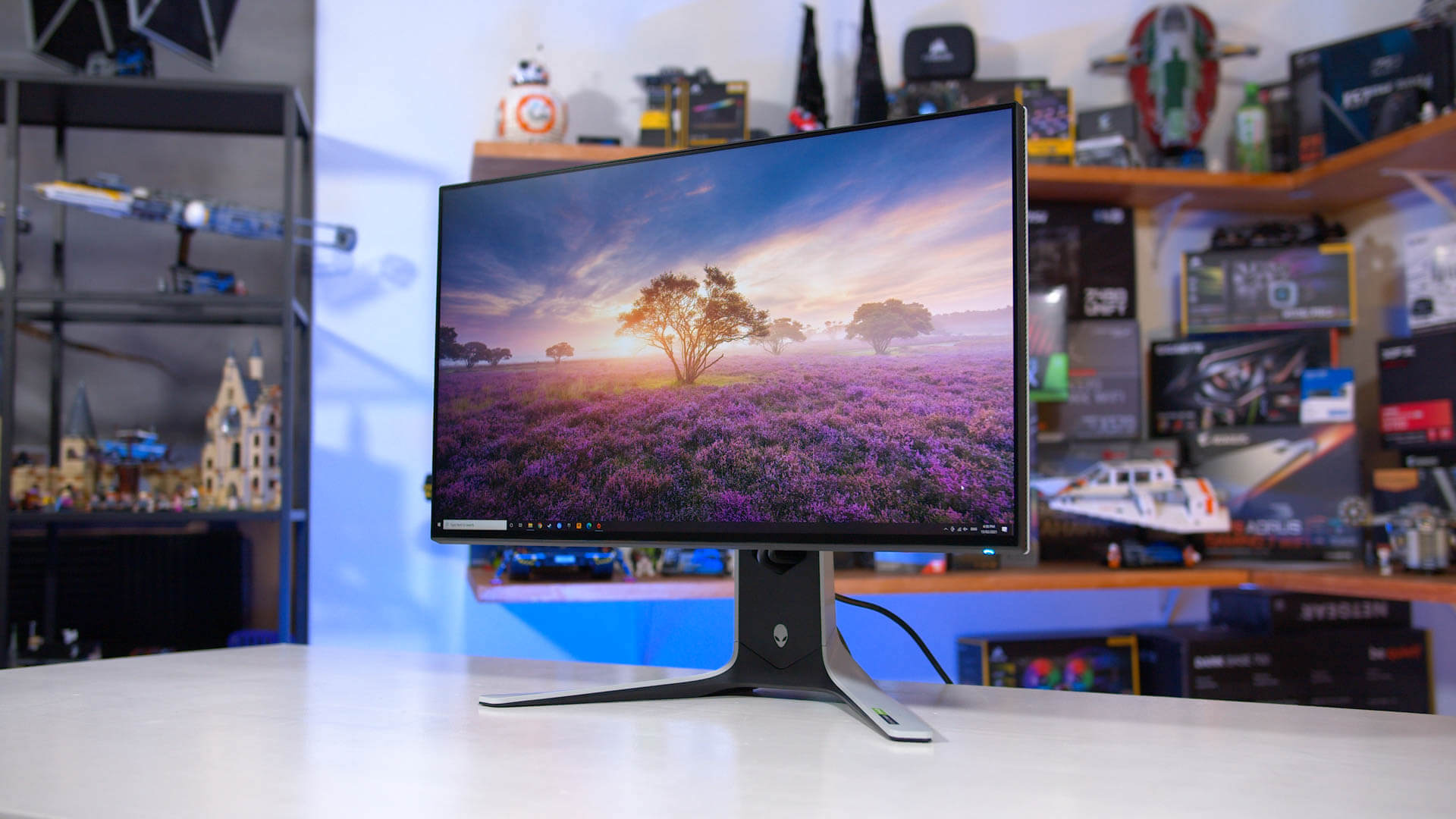
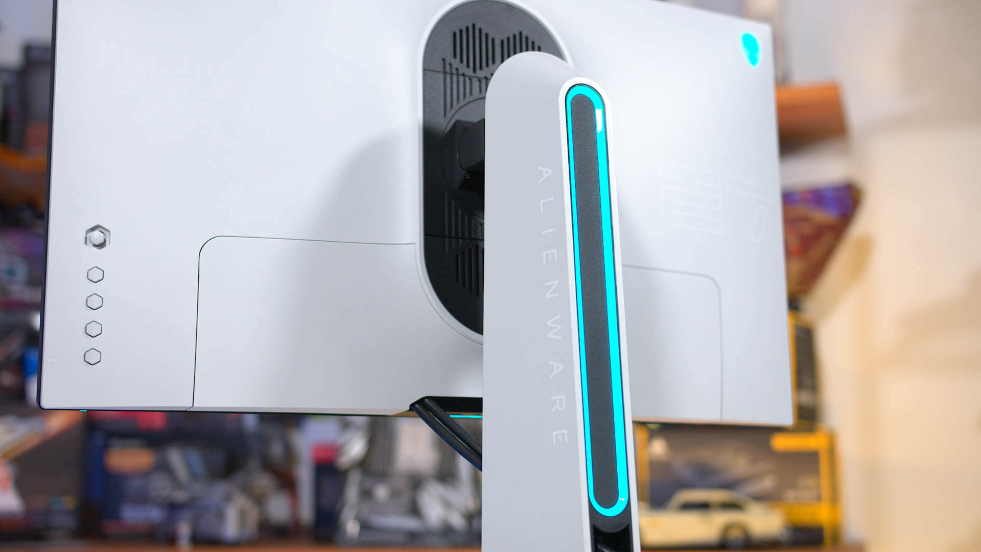
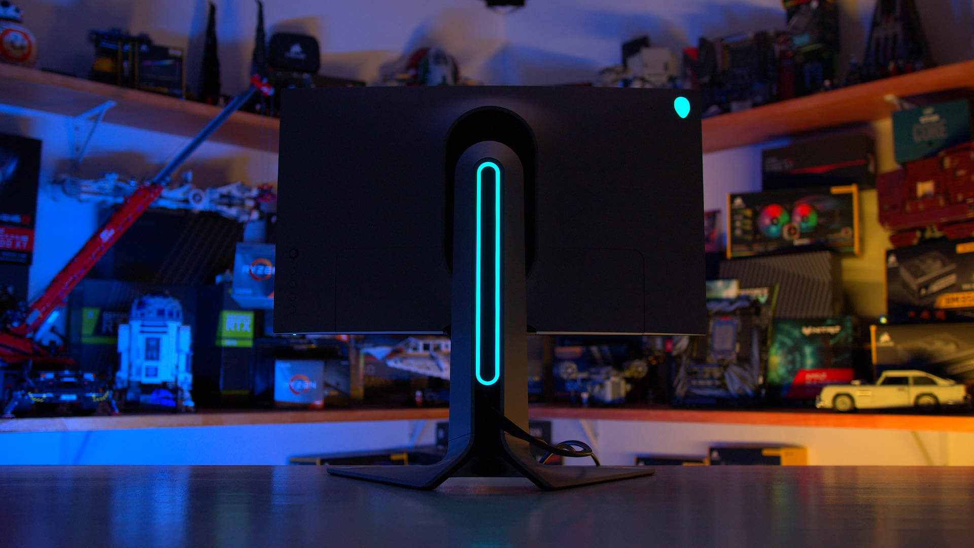
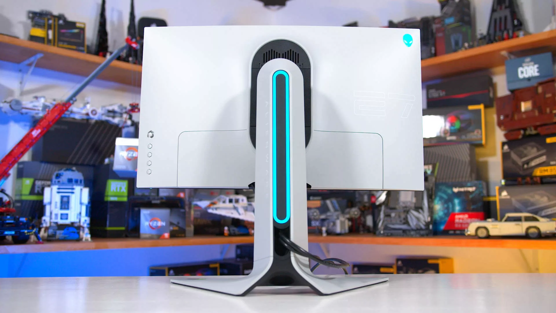
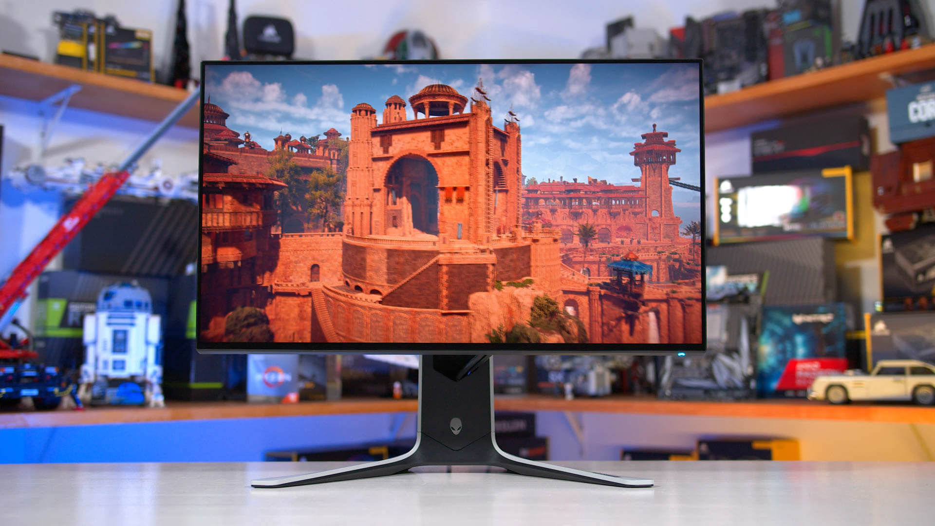
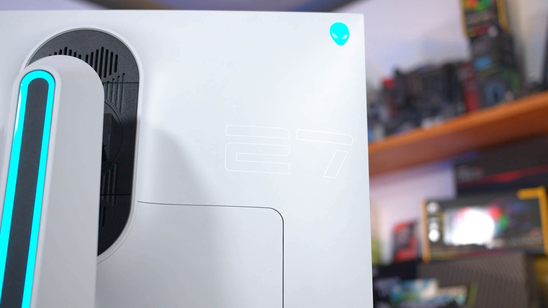
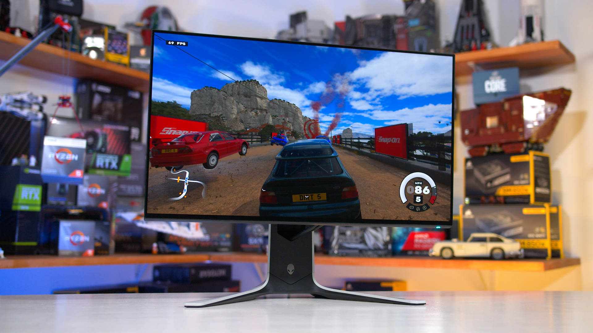
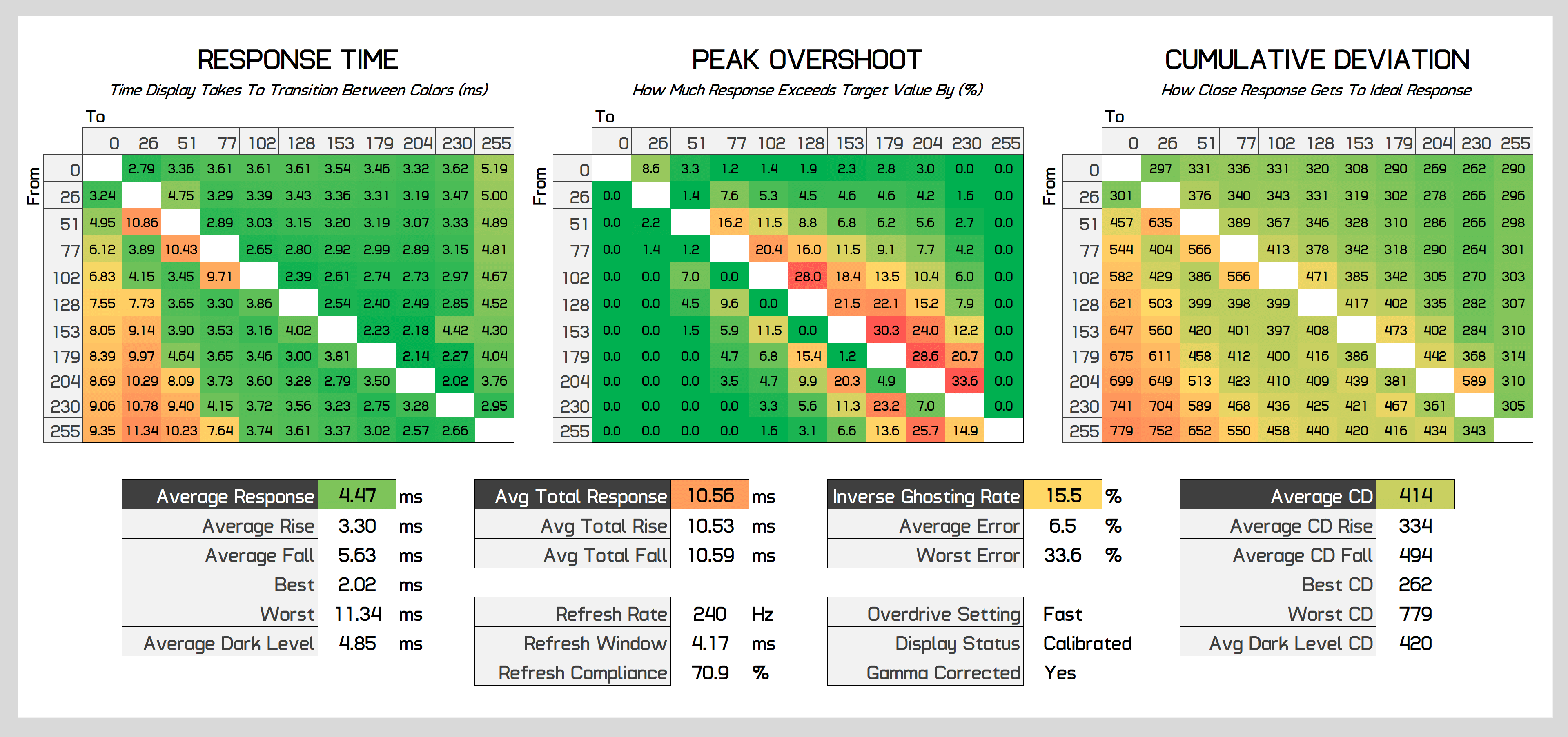
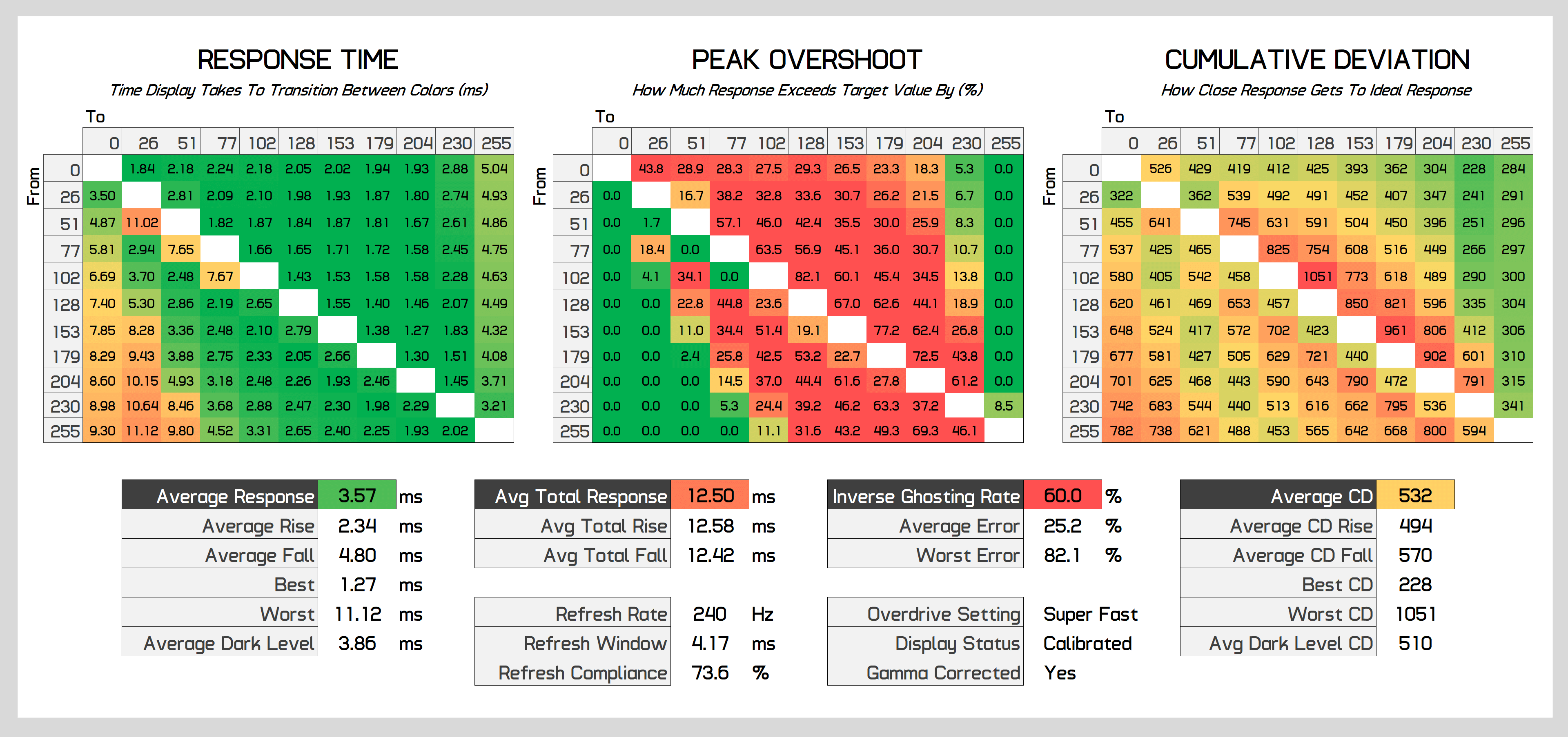
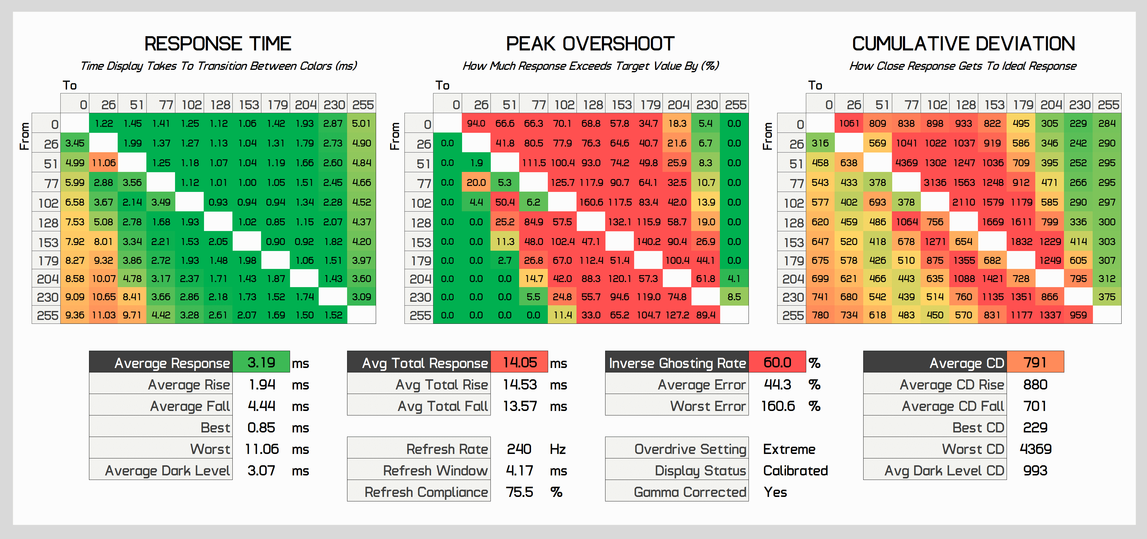
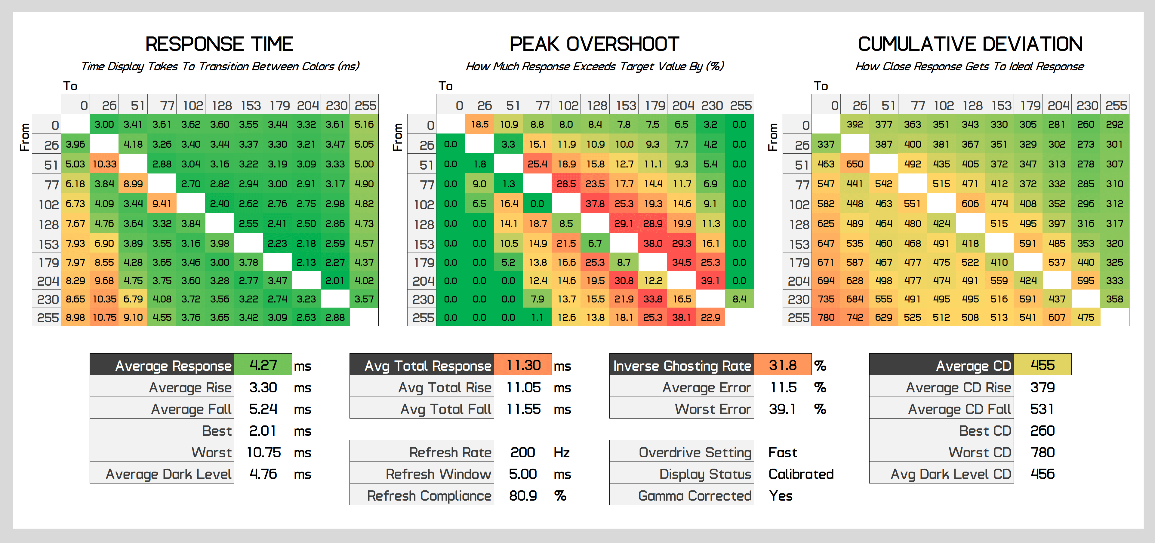
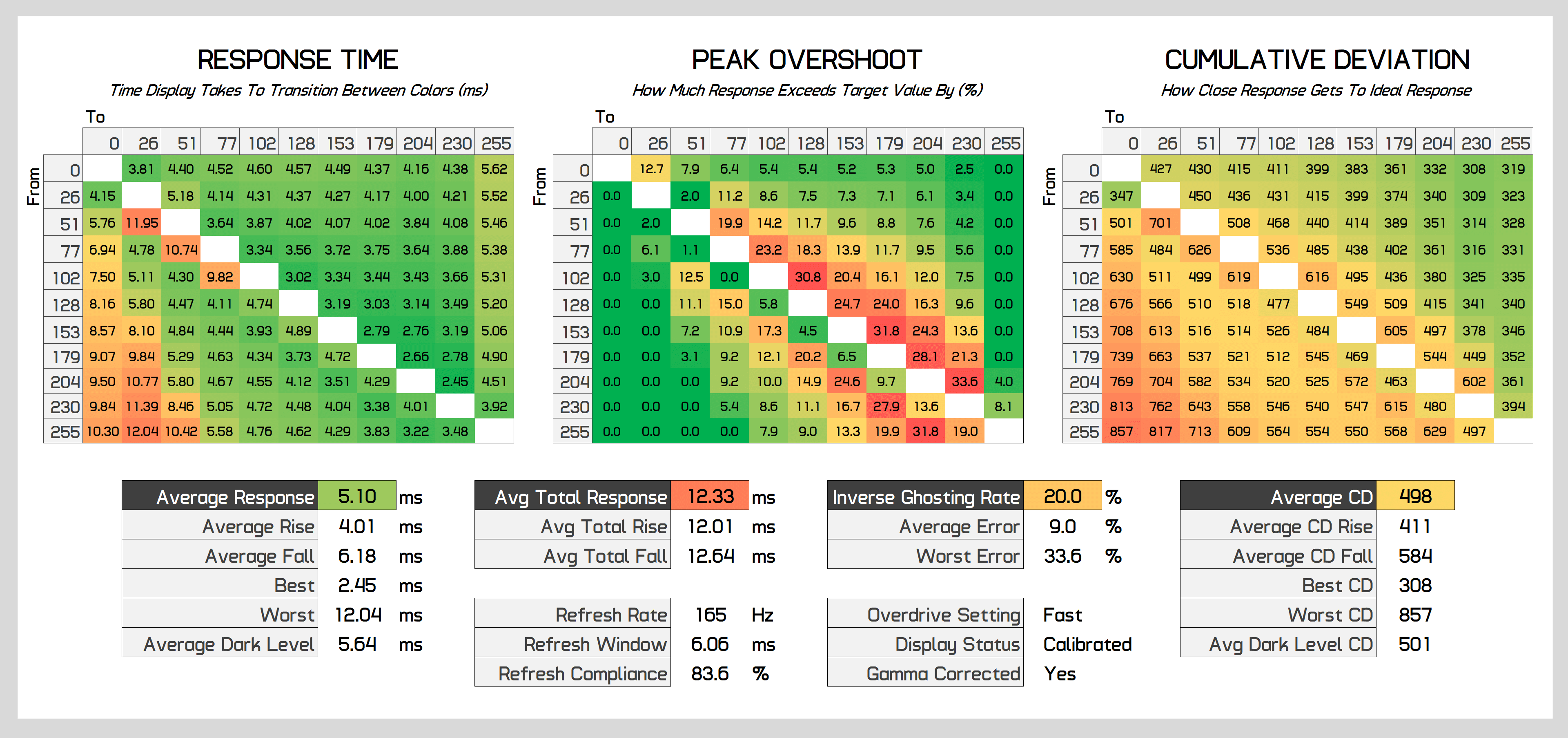
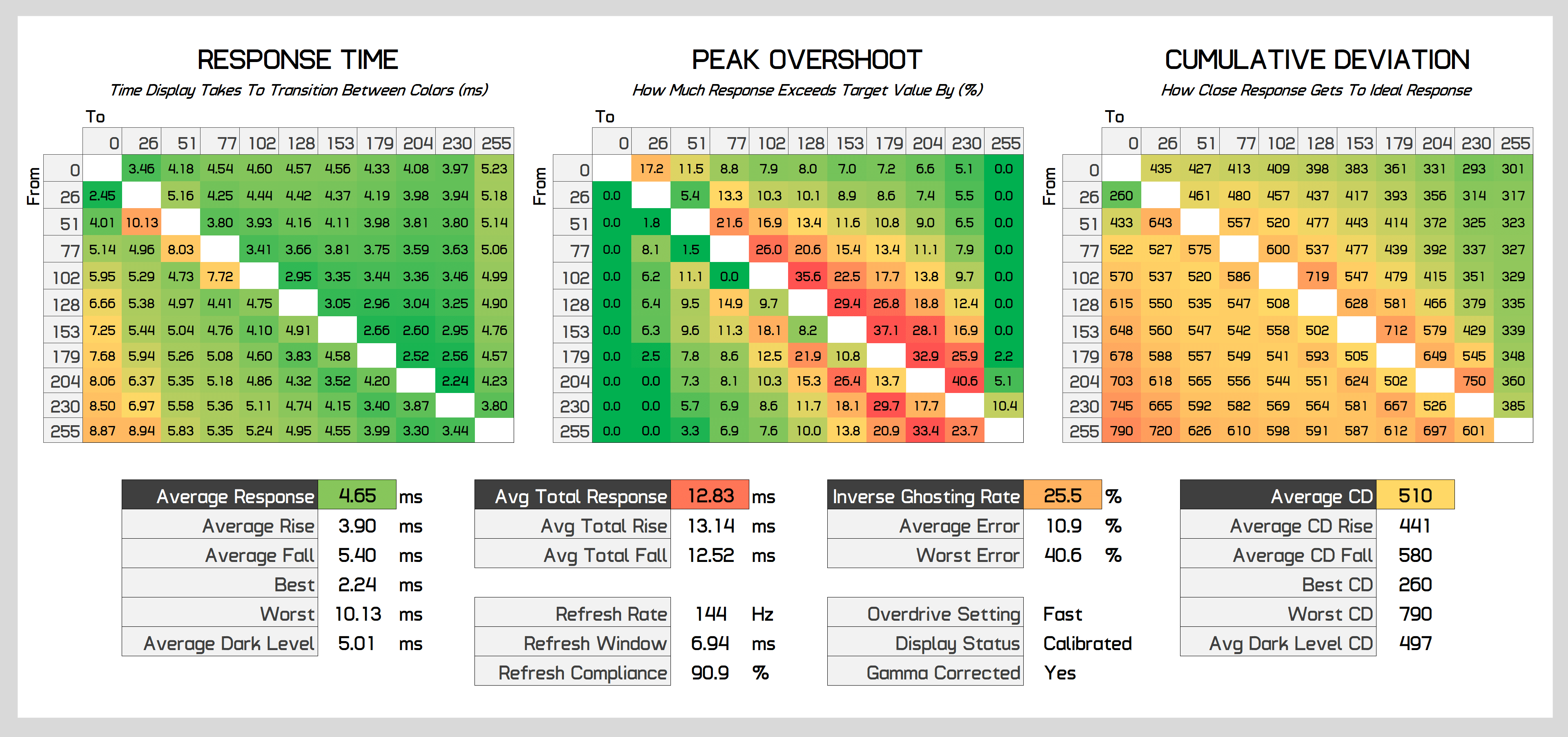
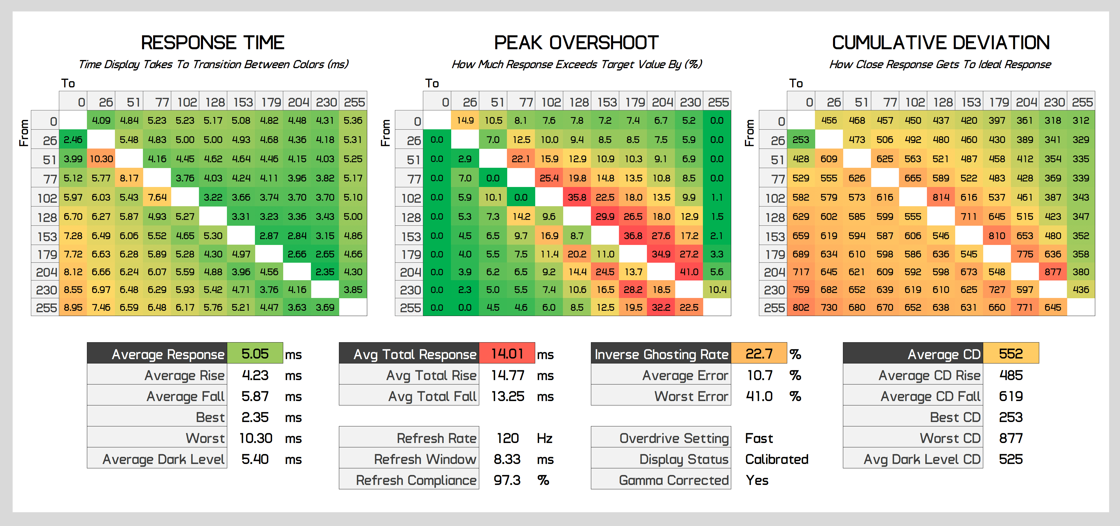
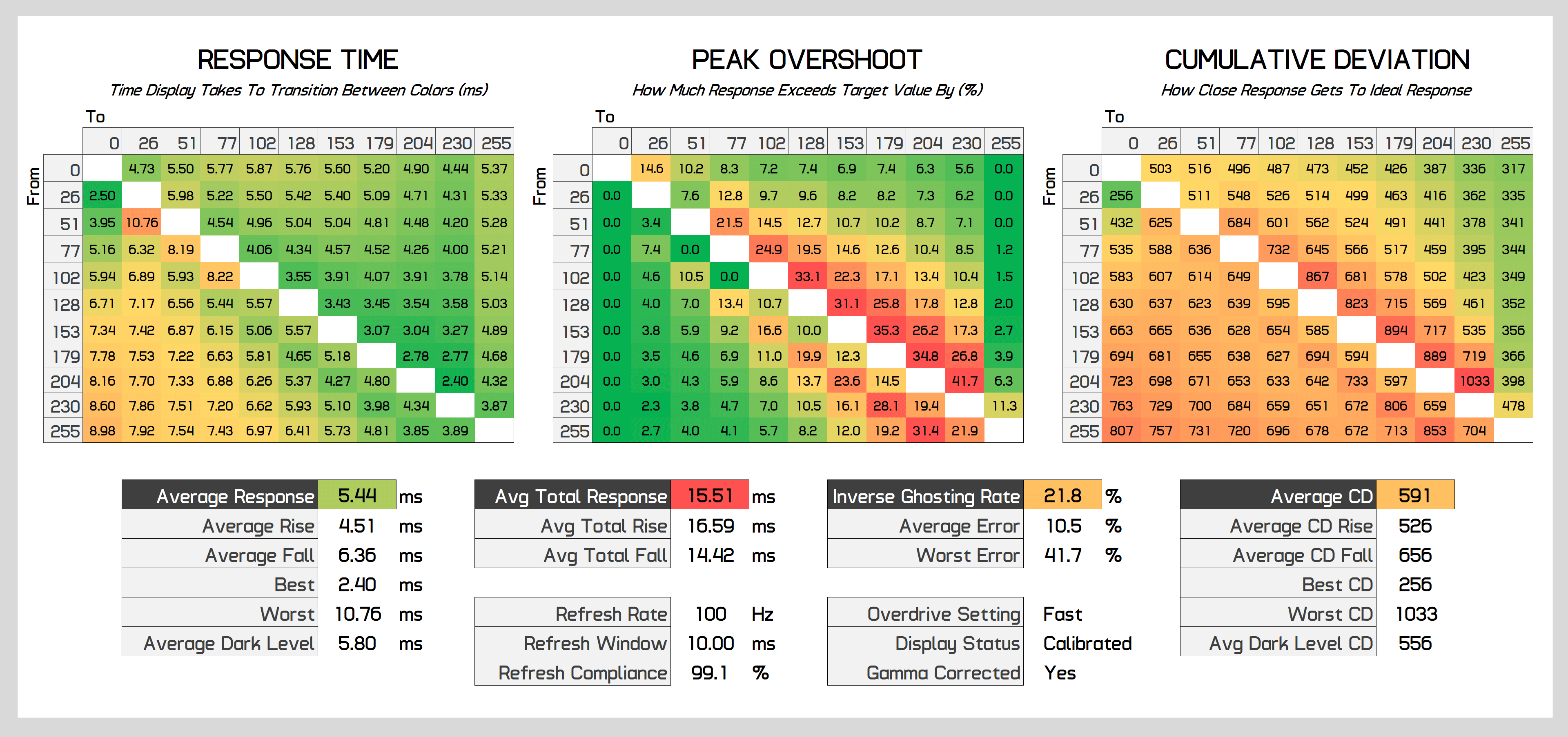
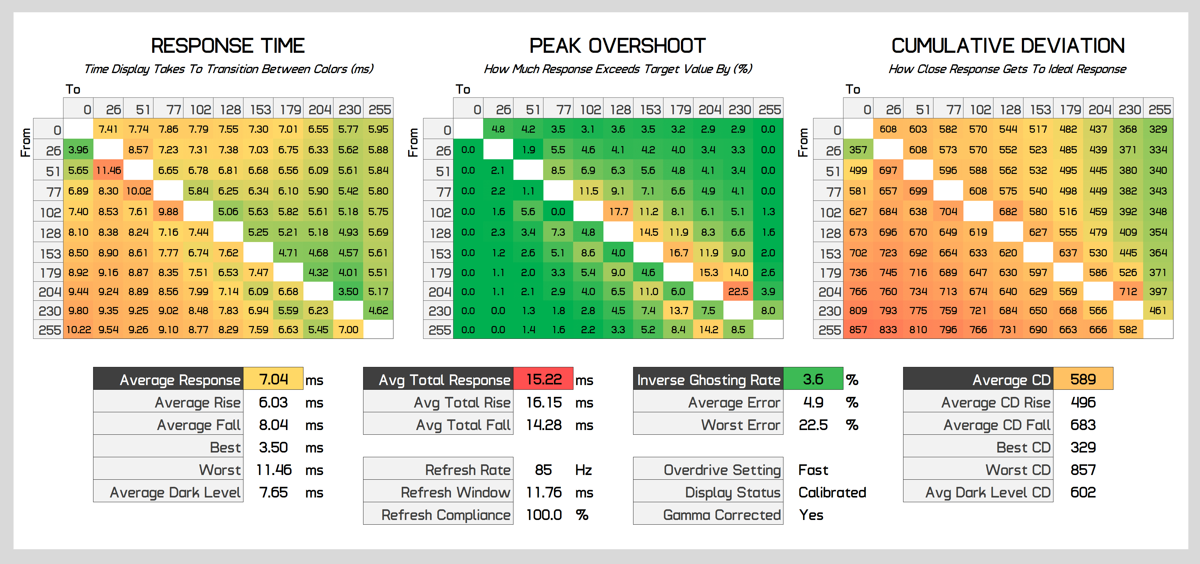
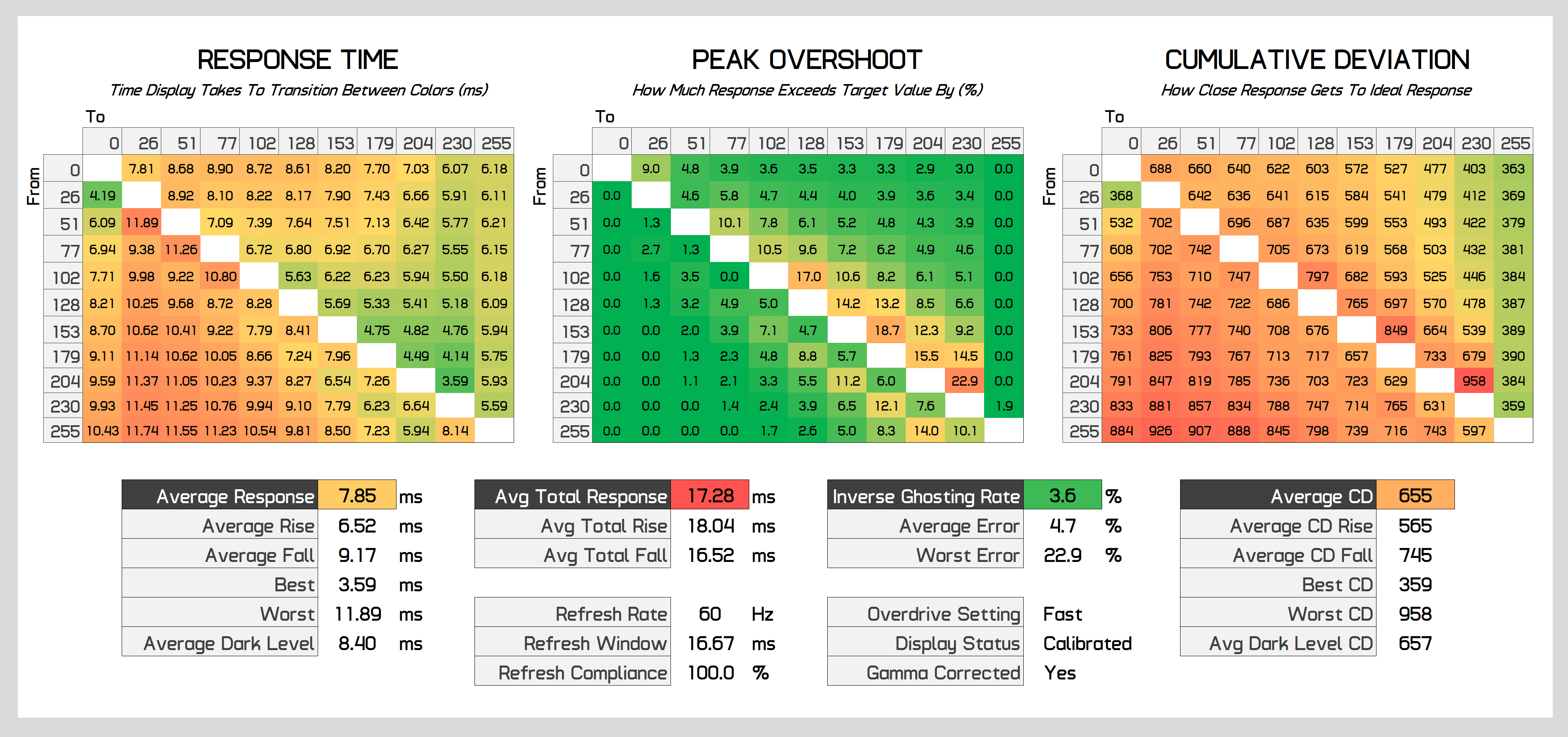
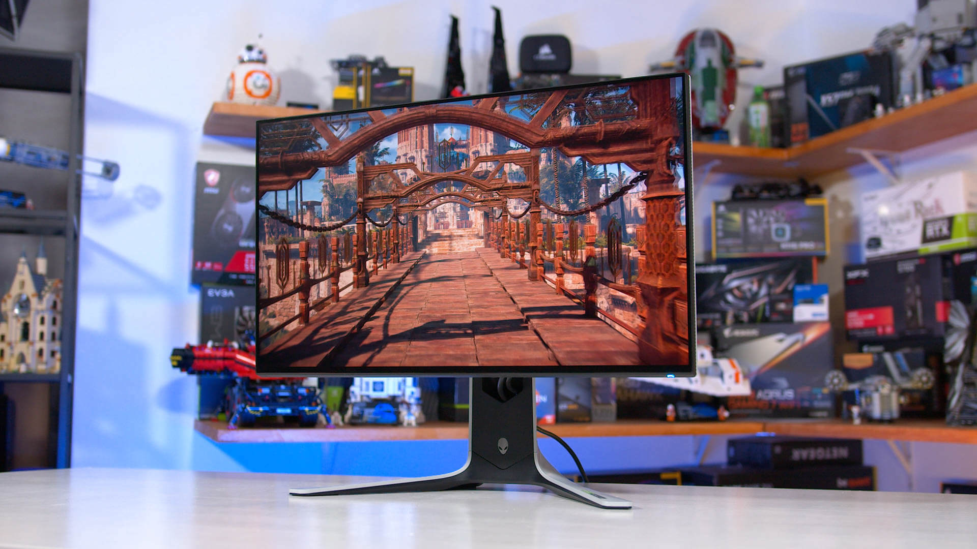
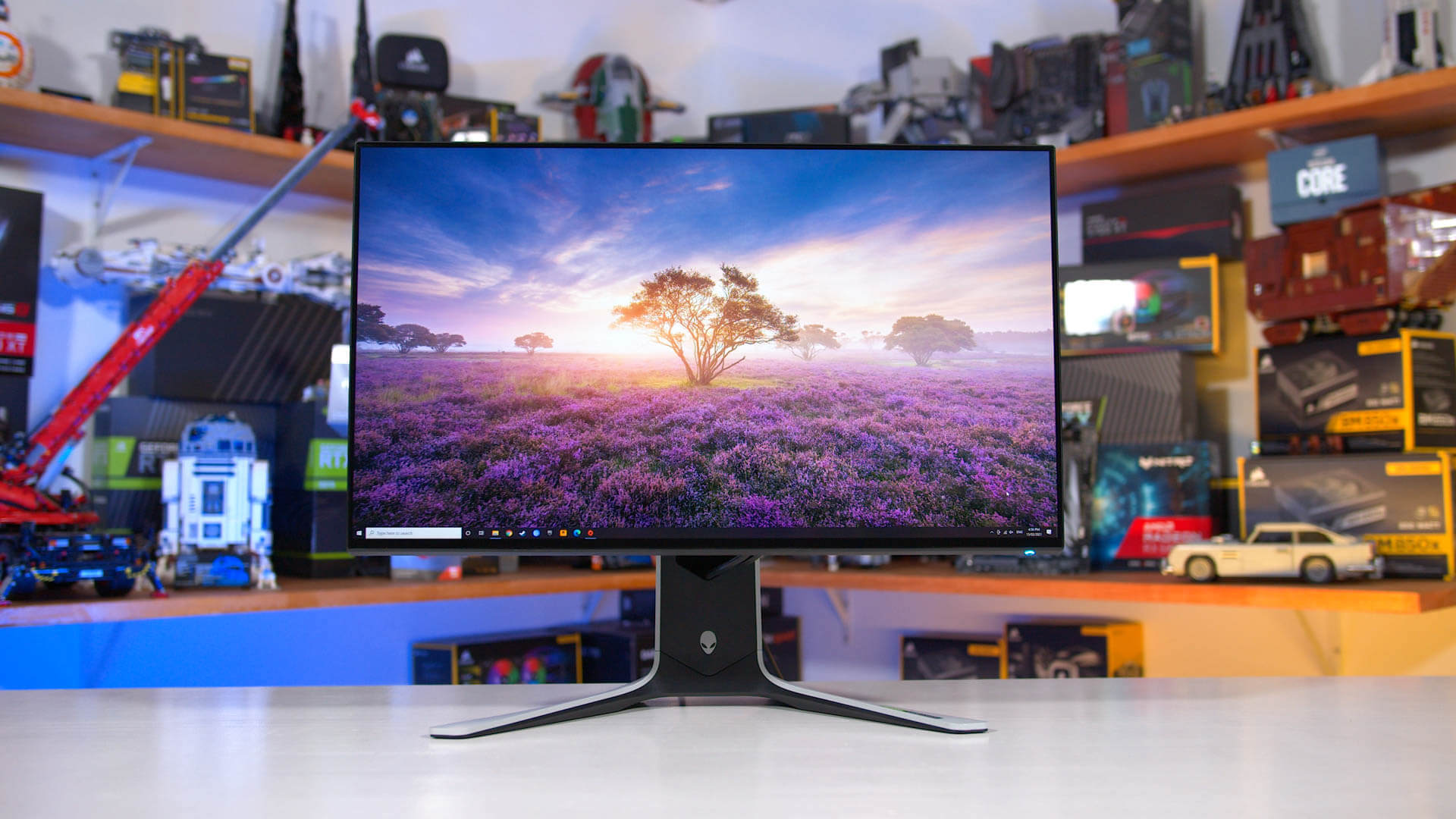
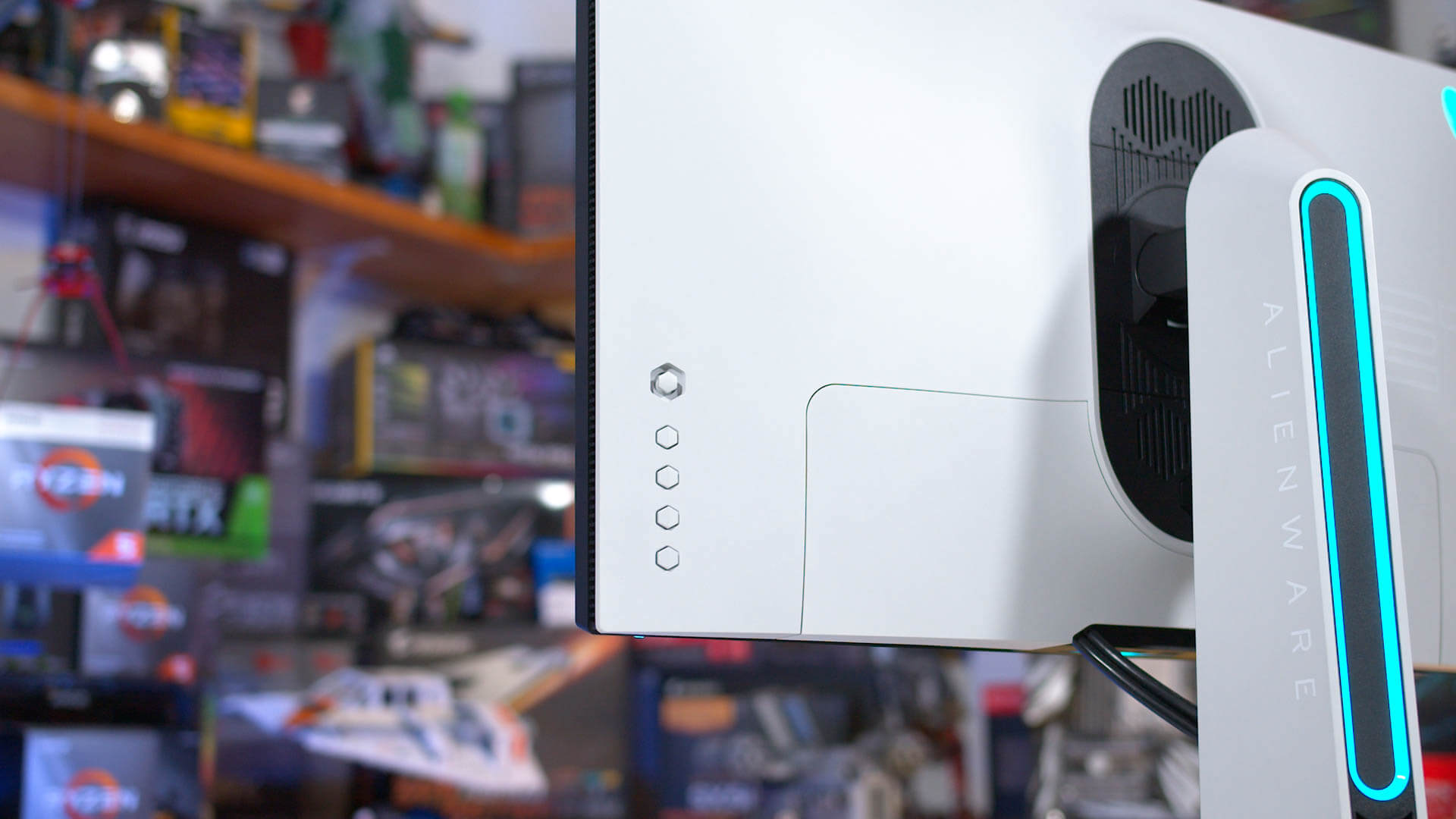
| Alienware AW2721D 27″ Gaming Monitor Review Posted: 04 Mar 2021 01:28 PM PST We’re kicking things off today with our first monitor review of 2021, we’re taking a look at the Alienware AW2721D, a hot item at the moment. This is the first monitor we’re reviewing using our updated test methodology for 2021. If you missed all that detail, it's well worth a watch. The Alienware AW2721D is a new high-end 27-inch 1440p monitor, giving us our first look at the combination of a 240Hz refresh rate and IPS technology at this resolution. Alienware are touting "true 1ms GTG response time" – we'll see about that – but we do know the monitor uses a latest-generation LG IPS panel so we're expecting performance that's similar to other LG IPS products. Another important point on the spec sheet is G-Sync Ultimate support, although it's the new watered down G-Sync Ultimate, not the high standard the program once commanded. G-Sync Ultimate used to be for the best HDR displays on the market, but that's not the case in 2021, as the AW2721D has somehow qualified despite having just DisplayHDR 600 certification and only edge-lit local dimming. It is HDR compatible and features 98% DCI-P3 coverage, so we'll see how it performs a bit later. With its 1440p 240Hz capabilities, this new Alienware display is competing directly with the Samsung Odyssey G7, another 1440p 240Hz display we’ve looked at with a curved VA panel instead. The AW2721D offers something a bit different, and it's also more expensive, currently $825 when bought directly from Dell or Amazon. The good news though, is it is actually available, which we can't say about every new bit of hardware we test these days. The AW2721D is a large monitor for something that only has a 27-inch panel, and I'm not talking about bezels but the overall monitor body. The stand is beefy and it attaches to a rather thick display housing; the whole thing is much heavier than I expected, although this allows it to be very sturdy. And while the majority of the outer materials are plastic, I think it looks quite premium with its mixture of black and white soft finishes. I'm not a fan of the large 27 printed onto the rear but outside of that it's a pretty clean body with some nice curves. RGB lighting is found here, integrated into a light bar on the back of the stand as well as the classic alien head logo. This isn't a huge selling point for me, but it is something that other people find useful. Tucked neatly behind the magnetic port cover are a DisplayPort and two HDMI ports, plus some USB ports. You'll need to use DisplayPort to access the maximum 240Hz refresh rate, as HDMI is limited to just 144Hz at this resolution, and this display does not support HDMI 2.1. Alienware are offering the full complement of adjustability, including height, tilt, swivel and pivot capabilities, so you could operate this monitor in a portrait orientation if you wanted to. The level of height adjustment is also generous and I think it's helped by having such a huge stand assembly – even though the stand legs don't take up a ton of desk space. The on screen display is controllable through a directional toggle placed behind the monitor's bottom right corner, where you'll find a modest set of features. The color controls are a little lacking, however for gamers you do get refresh rate and timer options, though no cheat crosshairs. There's also no backlight strobing available, as the LG IPS panel has a slow red phosphor, which interferes with strobing as we've seen previously. Alienware only offers three response time settings, however the monitor uses a native G-Sync module, so variable overdrive is a feature and thus we shouldn't have to change settings very often. So let's see how it performs… Display PerformanceAt 240Hz using the lowest overdrive mode, Fast, it's clear that overdrive is indeed enabled. The reason I make this rather obvious point is that as Fast is the "lowest" mode, you actually can't disable overdrive on this display entirely. I'm not sure how many people actually would want to do that, but as you can see there is some overshoot present on the lowest mode, and without a lower setting this is the least amount of overshoot you'll see. Is this level of overshoot problematic? Not at all. The majority of transitions are not affected by any sort of noticeable overshoot, and instead we are left with a 4.47ms grey to grey average response time, which is excellent. Using our newer test methodology which is gamma corrected and measures more of the response time curve, we do spot some slower transitions, particularly fall times that have a longer trail. However based on the displays I've tested so far, this is somewhat common for IPS panels and this is far from the worst example. On the right you'll see our new cumulative deviation results, which measure how close the response behaviour gets to the ideal "instant" response. Given many of you won't have seen this metric before, I'll provide some context, in that scoring 414 points here is excellent and indicates a fast panel. An average result is around 600. We also get 70% refresh compliance, which using our new methodology is sufficient to call this a true 240Hz display, which is a great sign from an IPS panel. The overdrive settings above Fast are not worth using. Super Fast does decrease response times to 3.57ms on average, but this comes with a significant increase to overshoot. As a result, our cumulative deviation numbers increase, suggesting we are further from an ideal response than in the previous mode. The Extreme mode is even worse, and to me this looks like a setting included purely to market the monitor as being "1ms" – you can see the best transitions are in the 1ms range. I'd have much rather Alienware include a mode below "Fast" with less overshoot, than bother with this "Extreme" mode that looks a lot worse. In terms of performance across the refresh range, buyers of the AW2721D should stick with using the Fast mode, which provides a single overdrive mode experience, exactly what I'd expect from a premium display. At times, overshoot can be a little higher than I'd like, in particular at 200Hz, but for the most part the level of overshoot is manageable and not that noticeable in practice. You can see variable overdrive at play here, especially below 100Hz, where the monitor appears to switch to a slower mode to keep overshoot in check. This is fine for lower refresh rate gaming and I'm glad it's implemented this way to prevent users from having to change overdrive settings depending on the refresh rate they are gaming at.
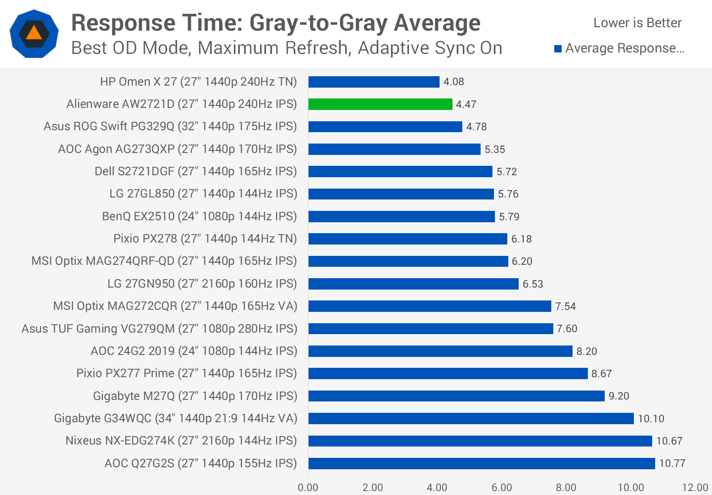
Comparing the AW2721D to other gaming monitors, the response time numbers are generally very solid when looking at peak performance recorded at the display's maximum refresh rate. An average result below 5ms is elite, putting this display among the fastest I've tested. The overshoot numbers are not amazing compared to the Omen X 27 for example, however performance is a step above 144 and 165Hz displays of the past, like the LG 27GL850.
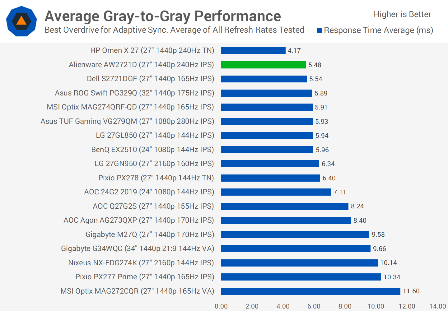
Average performance across the refresh range is also very solid, and interestingly performance is very similar between the AW2721D and Dell S2721DGF, both of which use LG IPS panels. Previous Nano IPS panels already had the response times to handle a 240Hz refresh rate, they just needed that sort of refresh rate to be unlocked, and it seems like that's basically what we are getting here.
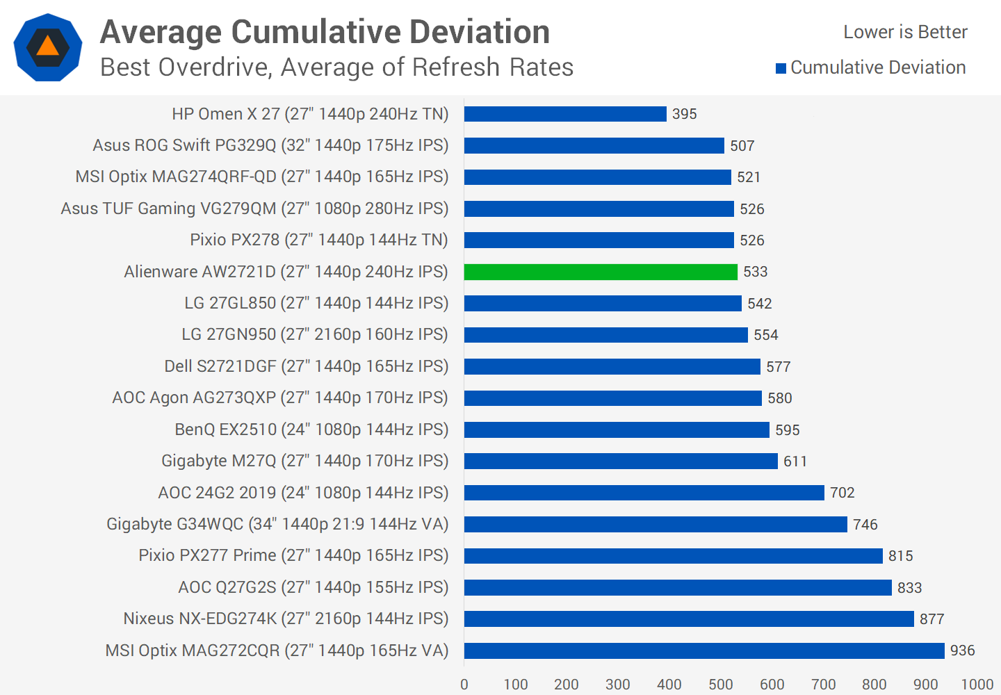
When viewing cumulative deviation, showing how close the monitor gets to the ideal response, the AW2721D sits among a huge glut of modern IPS monitors that all deliver a similar experience, in that 500 to 600 point range when measured across their refresh range. This Alienware monitor does benefit from an increased refresh range, and does so without negatively affecting its overall performance. However fundamentally this new 1440p 240Hz IPS panel from LG does not push IPS ahead in terms of response behavior compared to what was already on the market. That's not a bad thing at all, but those wanting an AW2721D specifically for better performance even at lower refreshes like 144Hz aren't really getting that. Again the main benefit is simply a higher refresh rate overall.
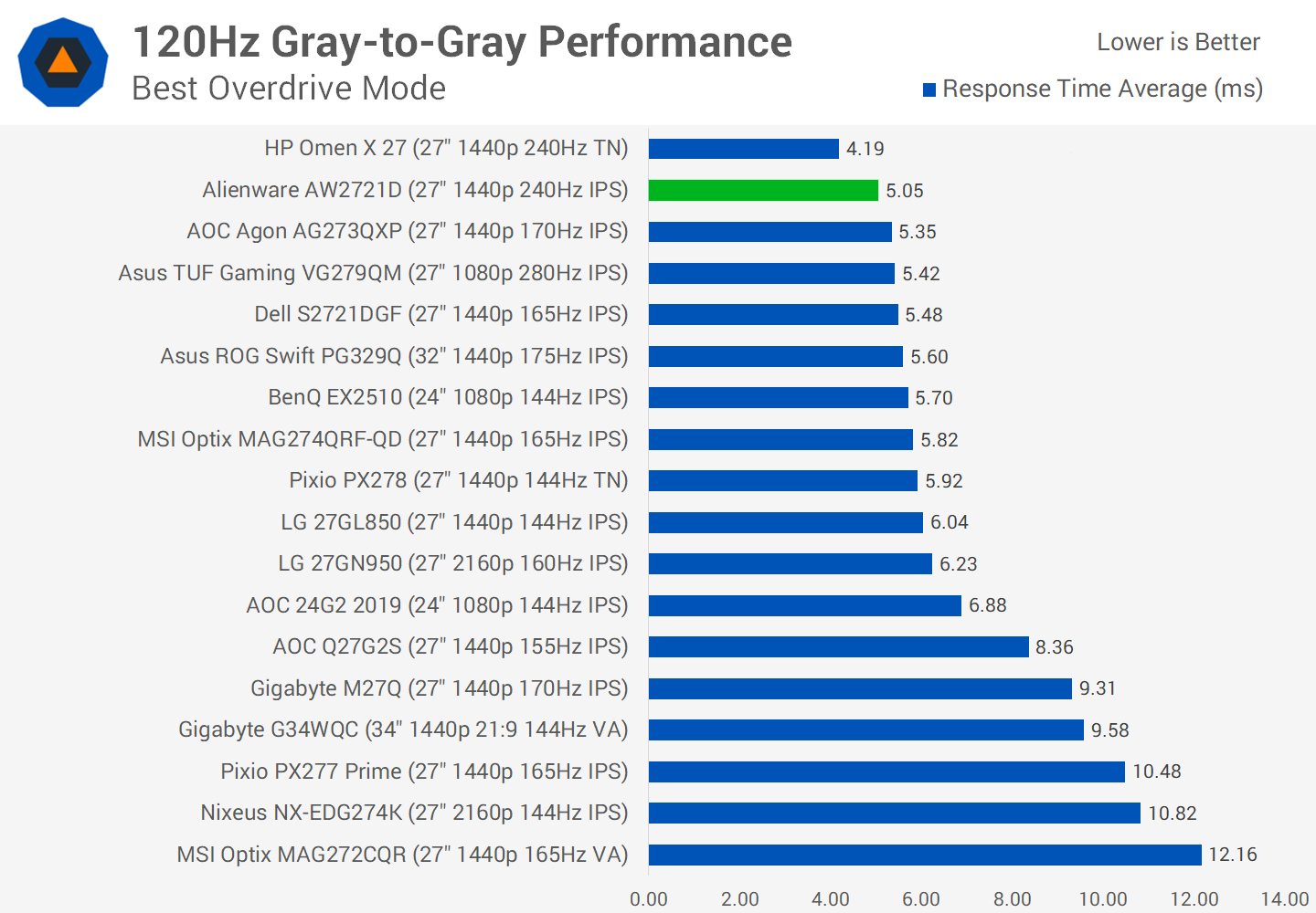
And you'll see what I'm talking about when we look at response times recorded at 120Hz. The AW2721D does deliver great performance in that 5ms range, but it's not fundamentally different to other offerings, so buyers of this display should be primarily interested in gaming above 165Hz either now or in the future.
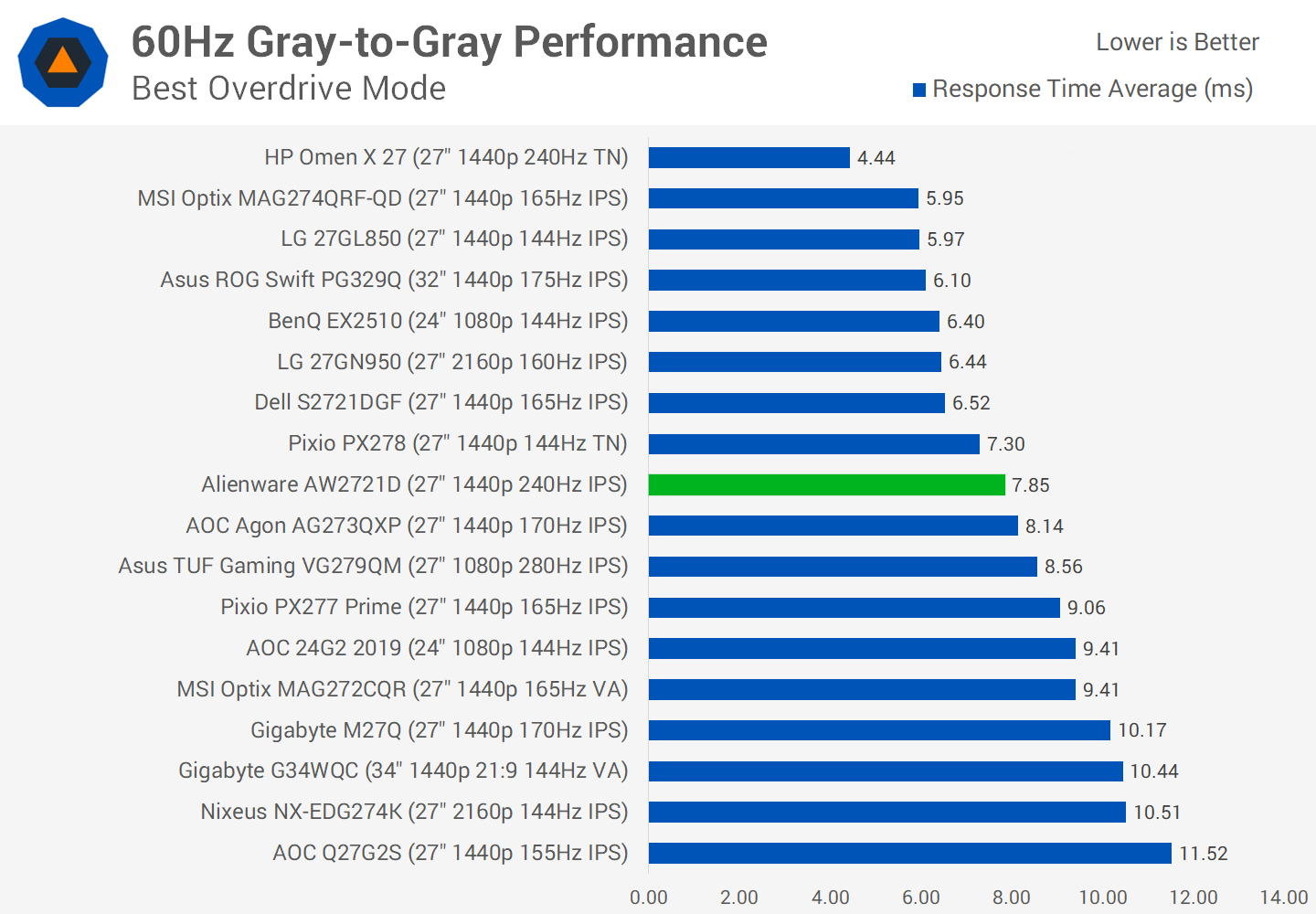
Meanwhile, due the way variable overdrive operates on this monitor, the AW2721D is only a mid-range performer at 60Hz. You're actually better off with an LG 27GL850 for gaming in that lower refresh range, although if you wanted faster response times and were okay with much higher overshoot then you could increase the overdrive mode one notch.
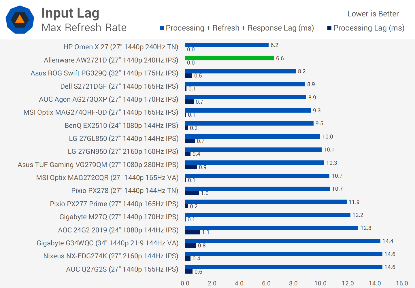
Input latency is excellent at 240Hz, with practically no processing delay on the monitor's side, leaving the only remaining latency due to refresh lag and response lag. Anything below 5ms is excellent and delivers a highly responsive experience. In terms of the best performance at 240Hz, the AW2721D isn't quite as good as the Odyssey, mostly due to higher overshoot at a similar response time average. But these displays do trade blows and the Alienware monitor isn't that far behind. On average across the refresh range, the G7 does have a clearer edge, ending up with less overshoot and also a 10 percent faster response on average. Samsung's latest VA technology with no dark level smearing is extremely impressive, and holds up a bit better for these premium high refresh rate displays than IPS.
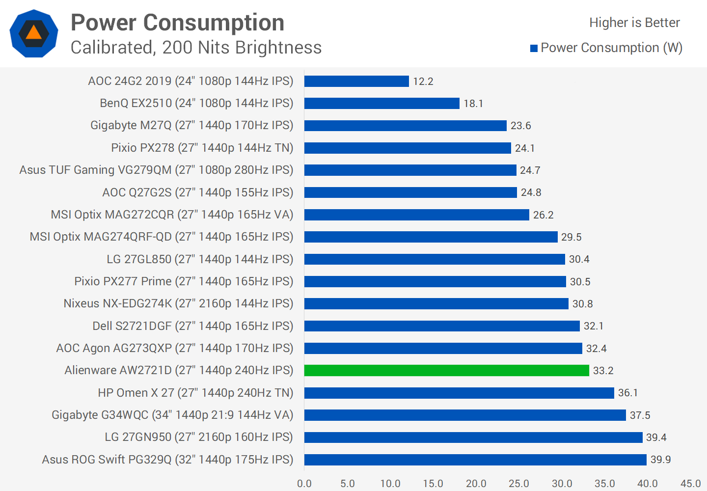
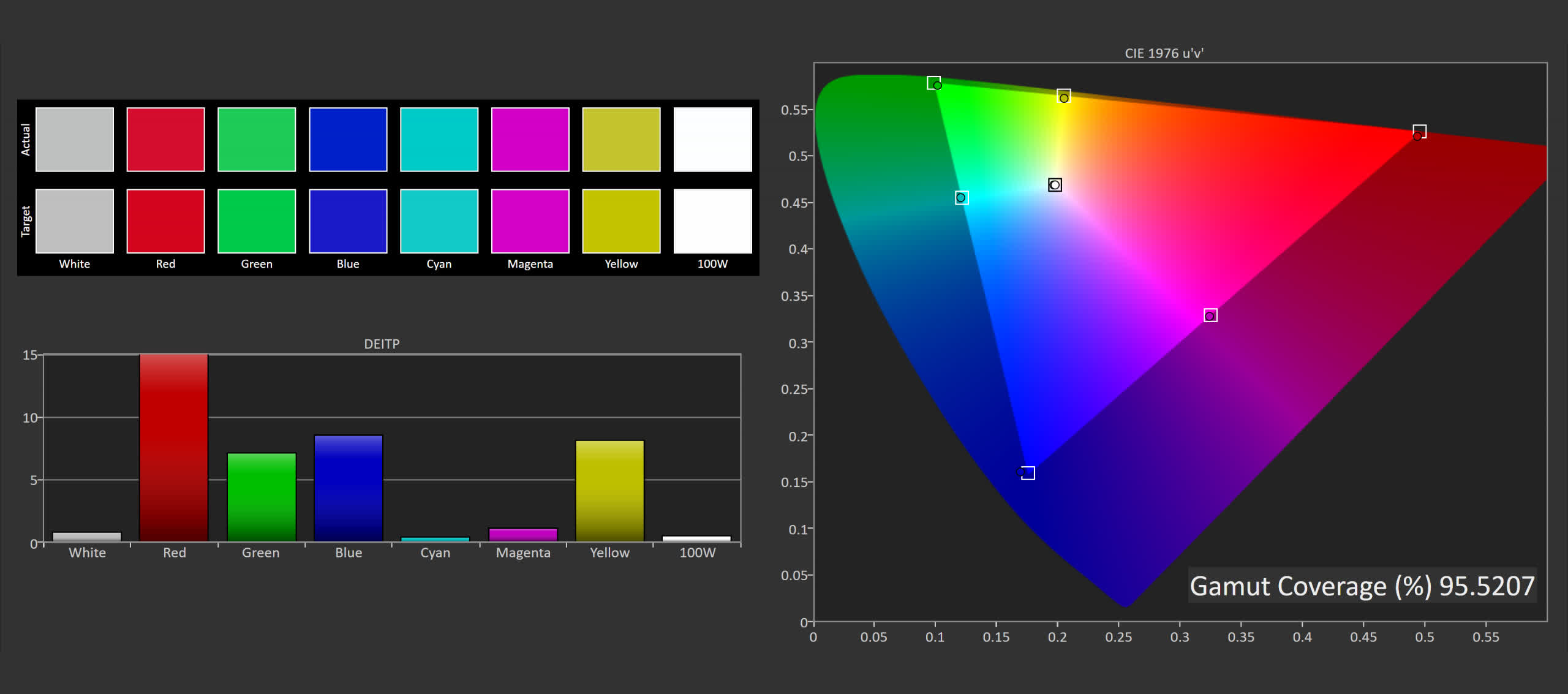
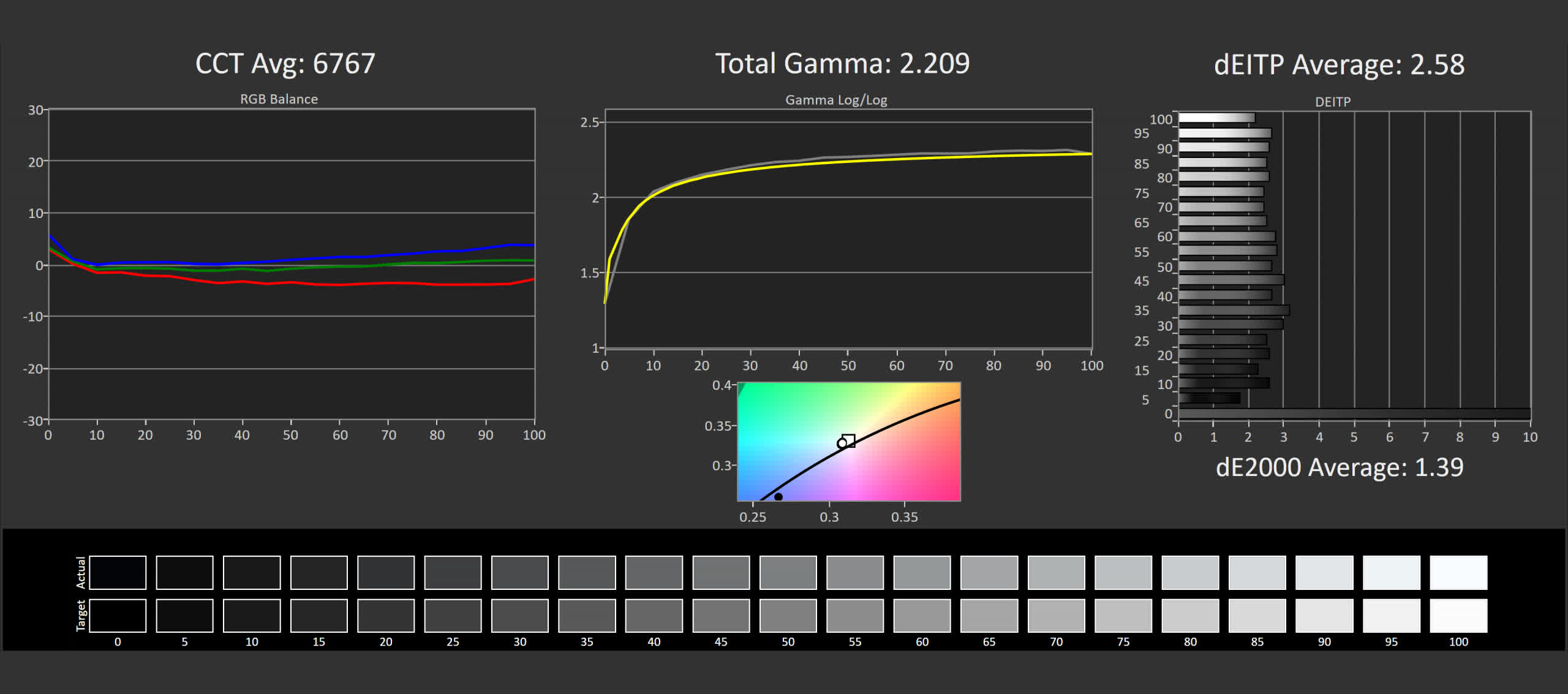
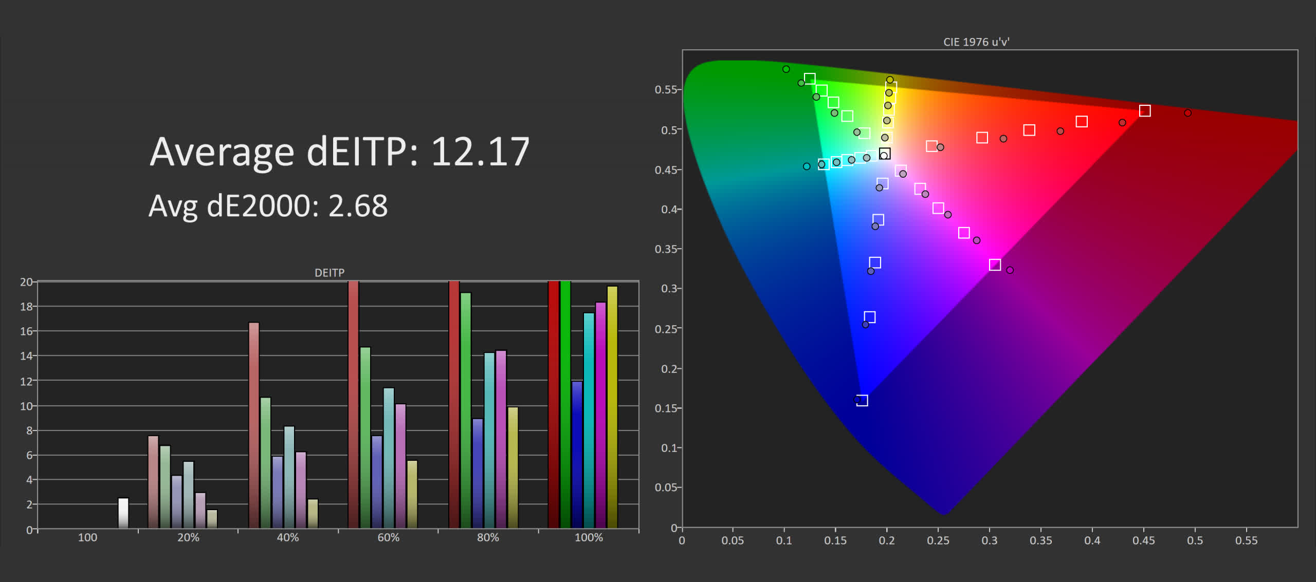
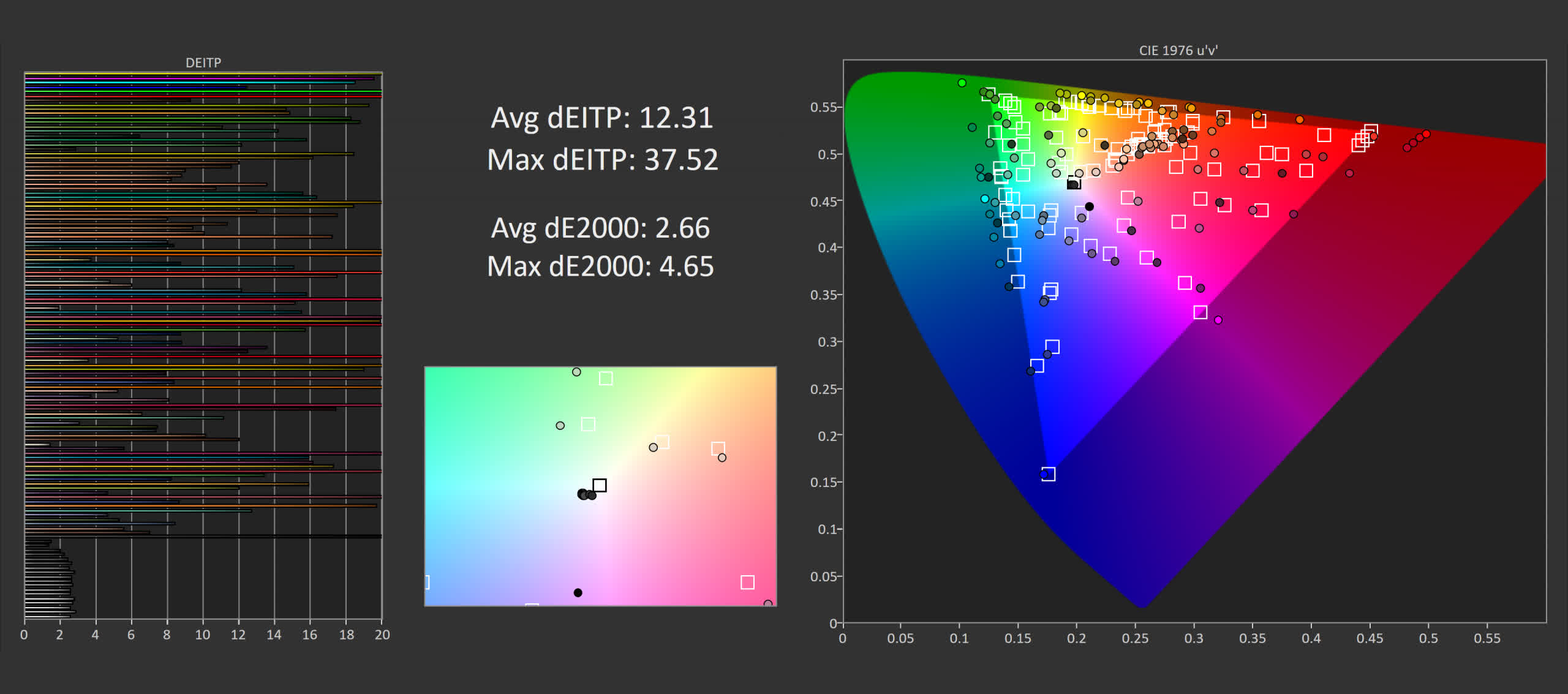
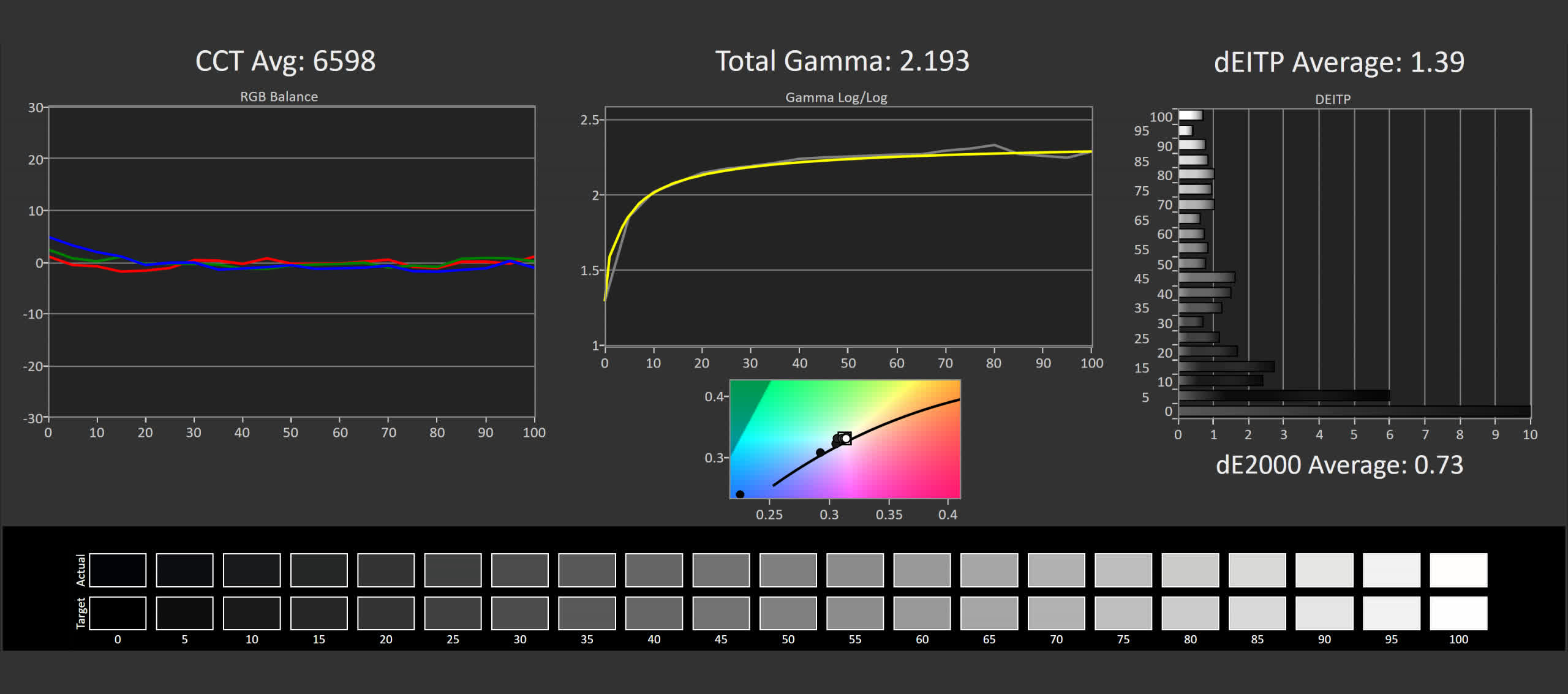
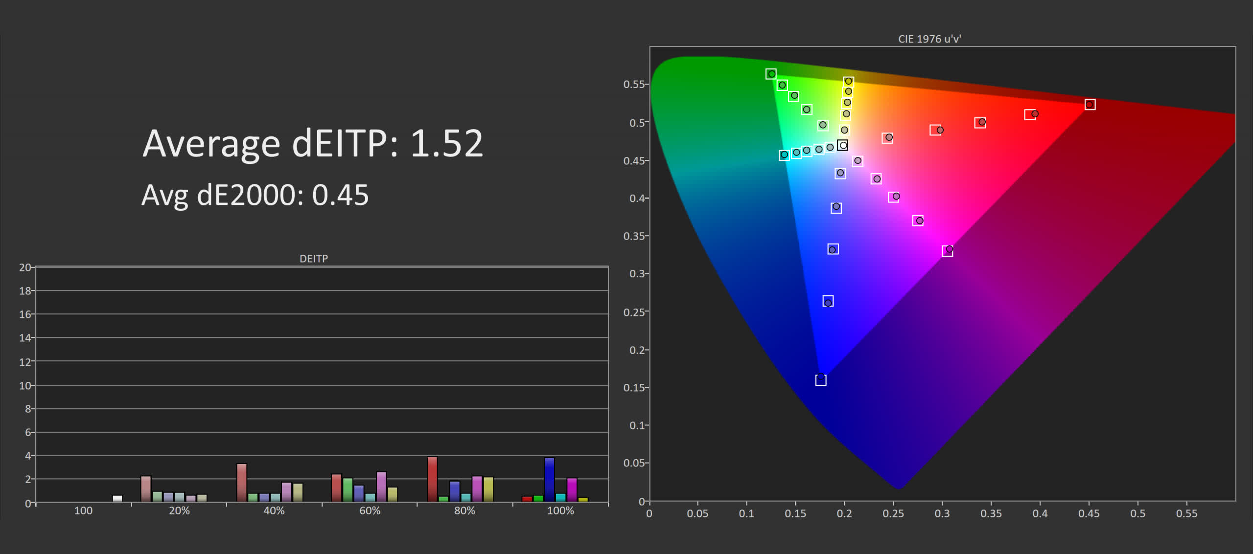
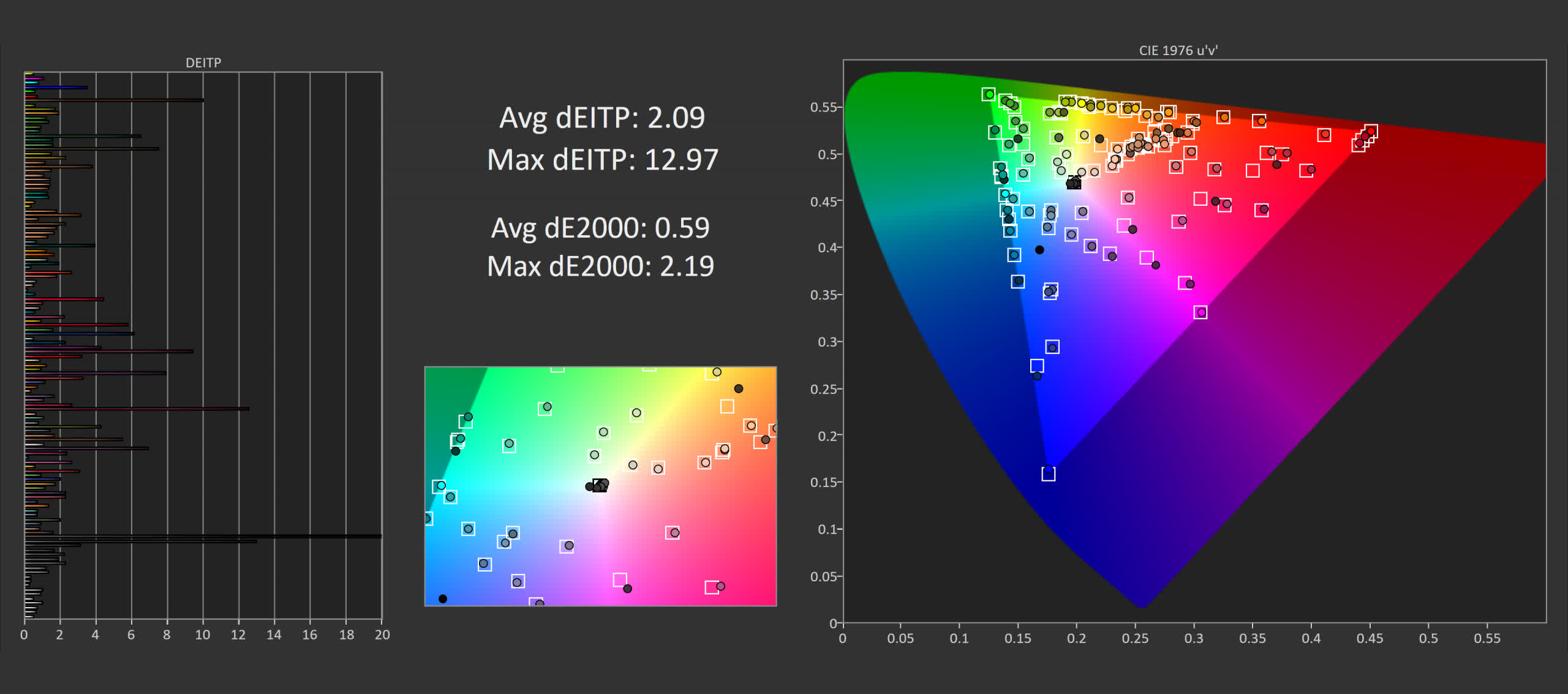
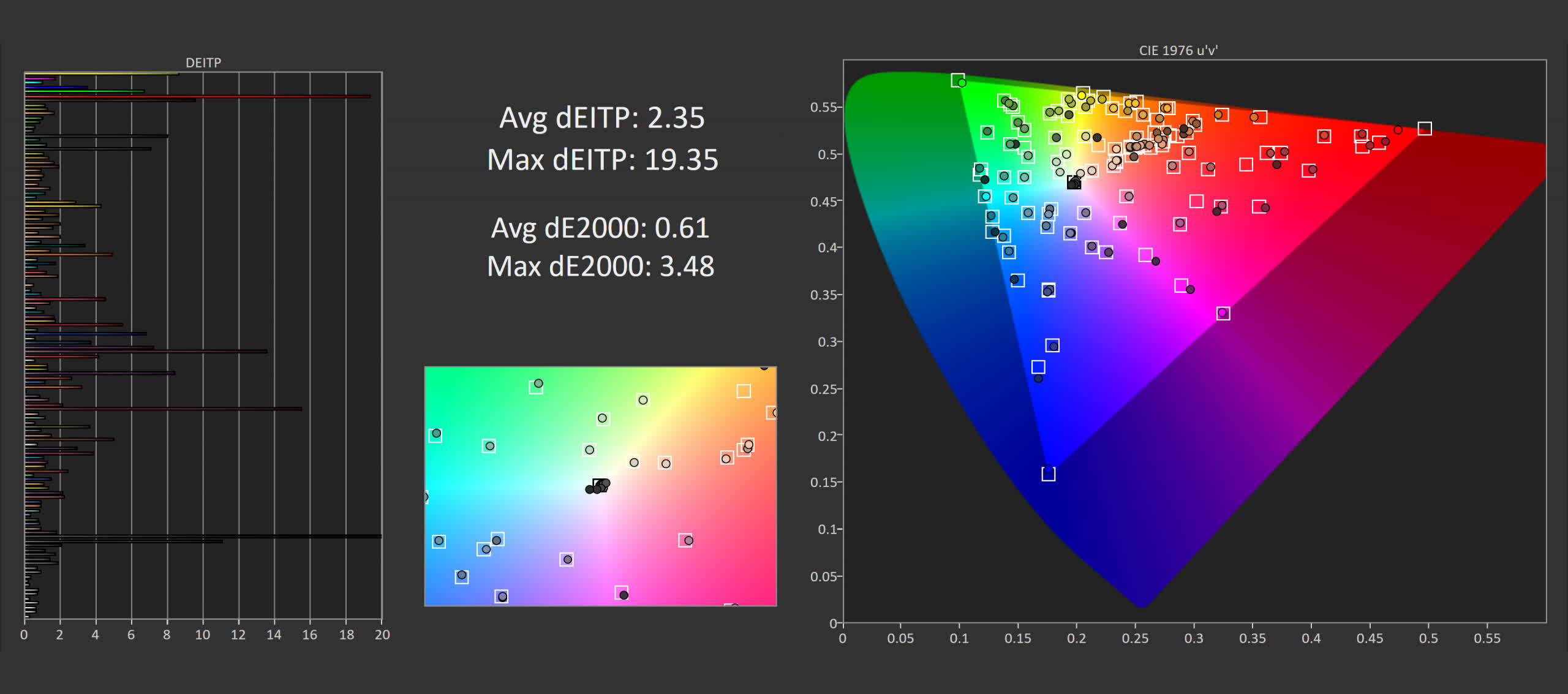
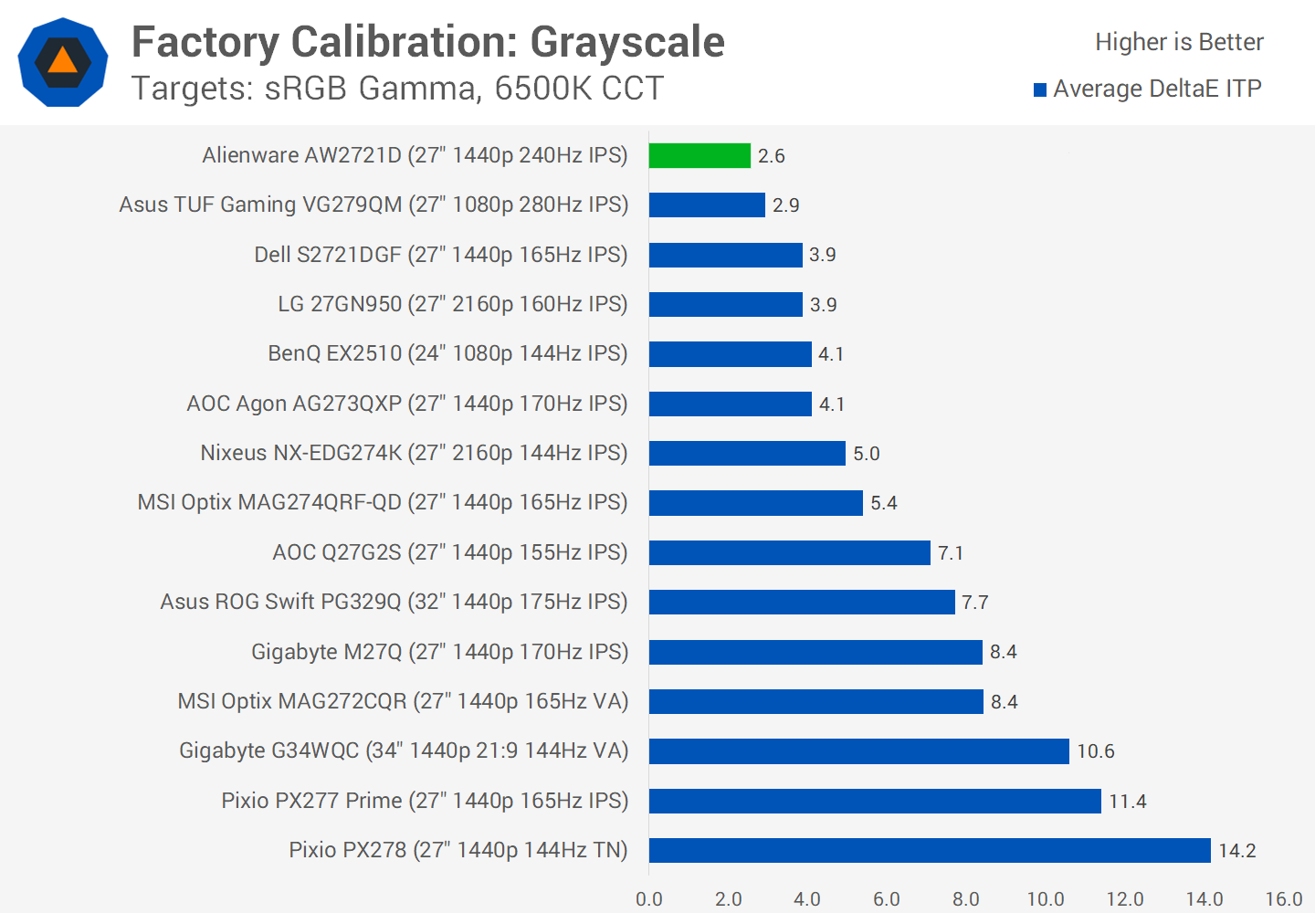
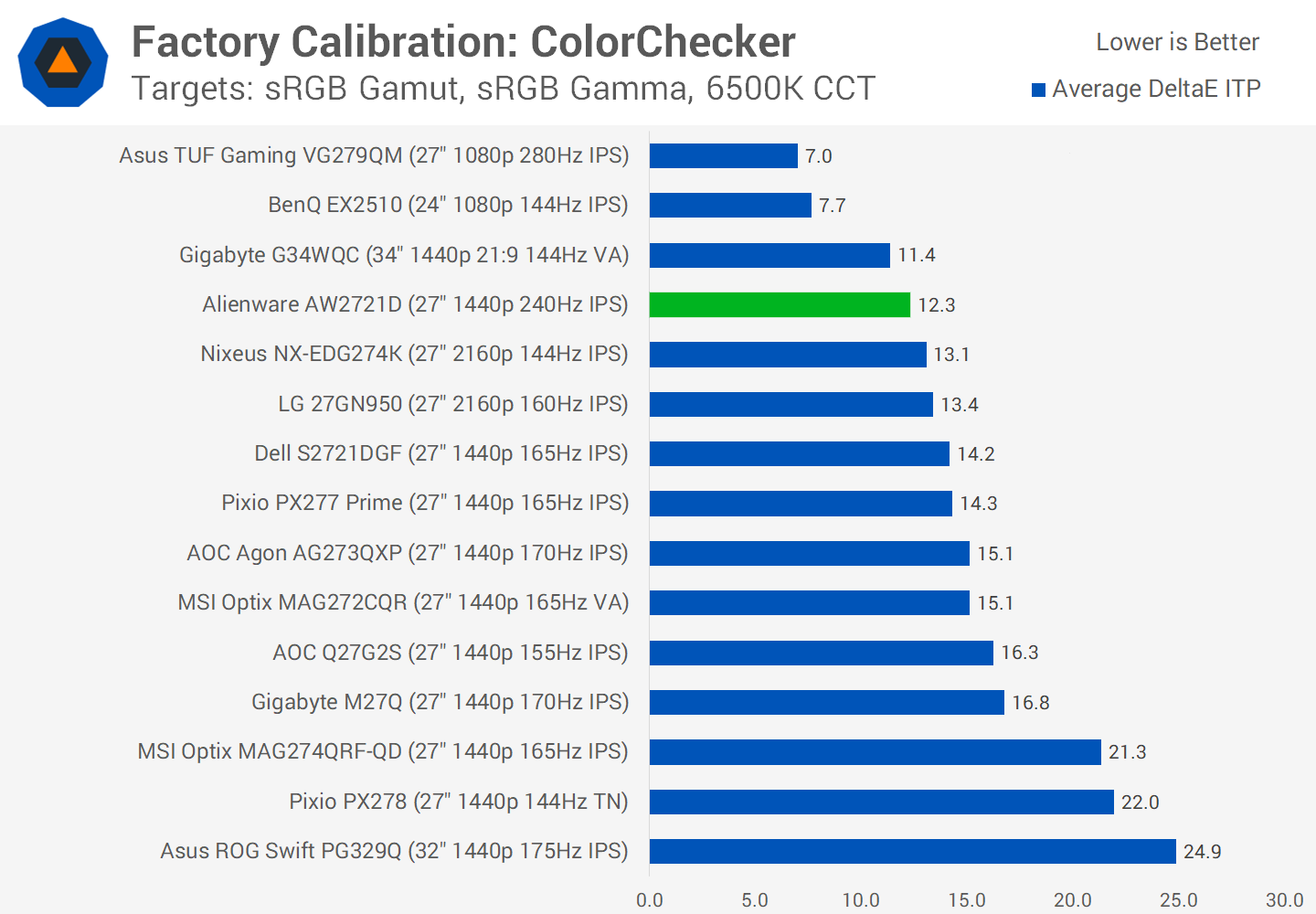
Nothing unusual from the power consumption side of things, the AW2721D is slightly more efficient than the HP Omen X 27's TN display, even factoring in RGB lighting. Color PerformanceColor Space: Alienware AW2721D – D65-P3Moving into color performance and the AW2721D is a wide gamut display, featuring 96% coverage of the P3 color space, so that's great for creators that want to leverage this display for their wide gamut work. However, a big negative is the AW2721D does not have an sRGB mode, so there is no way to emulate or clamp this gamut down to sRGB for viewing regular content. This will leave viewers with an oversaturated experience in many instances, especially when (for example) watching YouTube videos, something that does not play nicely with ICC profiles. This is a huge oversight for a premium monitor. On the positive side, the AW2721D does feature excellent factory greyscale calibration. My unit had near perfect adherence to the sRGB gamma curve, and a negligible deviation from the accurate CCT curve. This led to low deltaEs from the factory, and virtually no appreciable tint to the monitor. One thing that G-Sync Ultimate monitors tend to succeed at is factory greyscale calibration and that's no exception with this display. Unfortunately when viewing sRGB content there is going to be some level of oversaturation. All things considered this isn't the worst result I've seen from a wide gamut display, and some people actually like this look, but it could be better. Similar results in ColorChecker, the positive being that skin tones aren't affected significantly so it's unlikely you'll see a "sunburned" look, however oversaturation is still present. Calibrated Color PerformanceAs grayscale performance is great from the factory and there's no sRGB mode, there is little that can be done in the OSD to improve performance, aside from a few minor tweaks if things are slightly off. The next step is a full calibration and as expected I achieved excellent results. A greyscale deltaE ITP below 2.0, and strong performance in other color metrics when measuring against sRGB; no surprise as there is 100% coverage of this color space. For P3 work we see generally strong results, although as coverage is only 96% instead of 100%, you will lose a small amount of accuracy at the top end of the saturation range. But this isn't significant enough to affect overall performance and I'd say that with calibration the AW2721D is a great monitor for P3.
When comparing factory greyscale calibration to other monitors I've tested, the Alienware AW2721D is one of the best, topping the charts as I like to see from premium displays. ColorChecker factory calibration is also not the worst, although sRGB only monitors like the BenQ EX2510 do deliver a noticeably better experience.
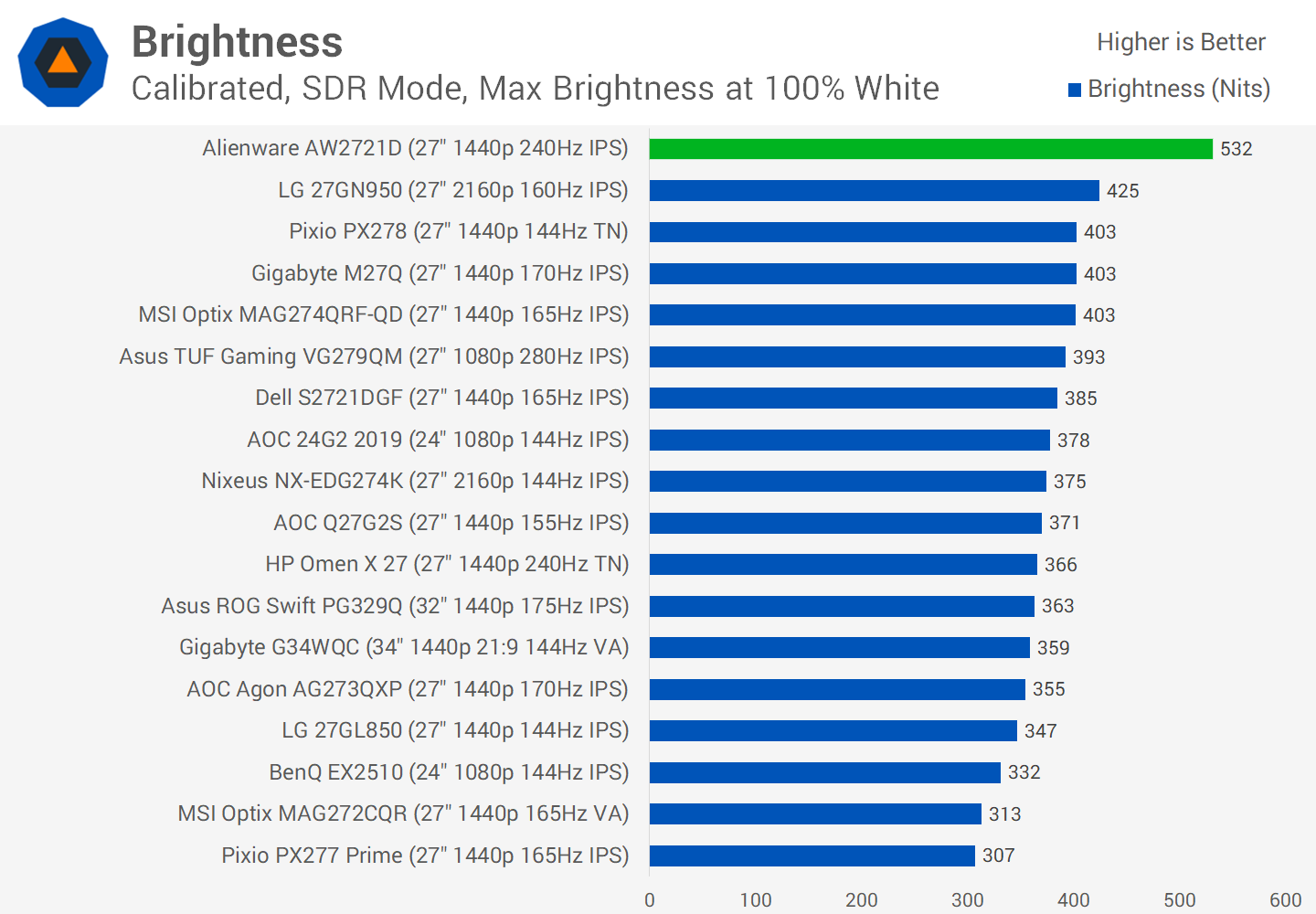
Maximum brightness is outstanding in the SDR mode, pushing 532 nits which is more than sufficient for indoor usage in pretty much all environments. Despite such high peak brightness, the AW2721D also delivers great minimum brightness at a touch below 50 nits, so there is a large range of values to tweak brightness to your liking.
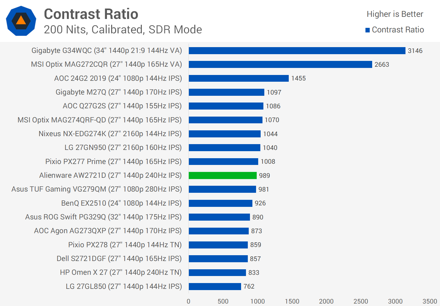
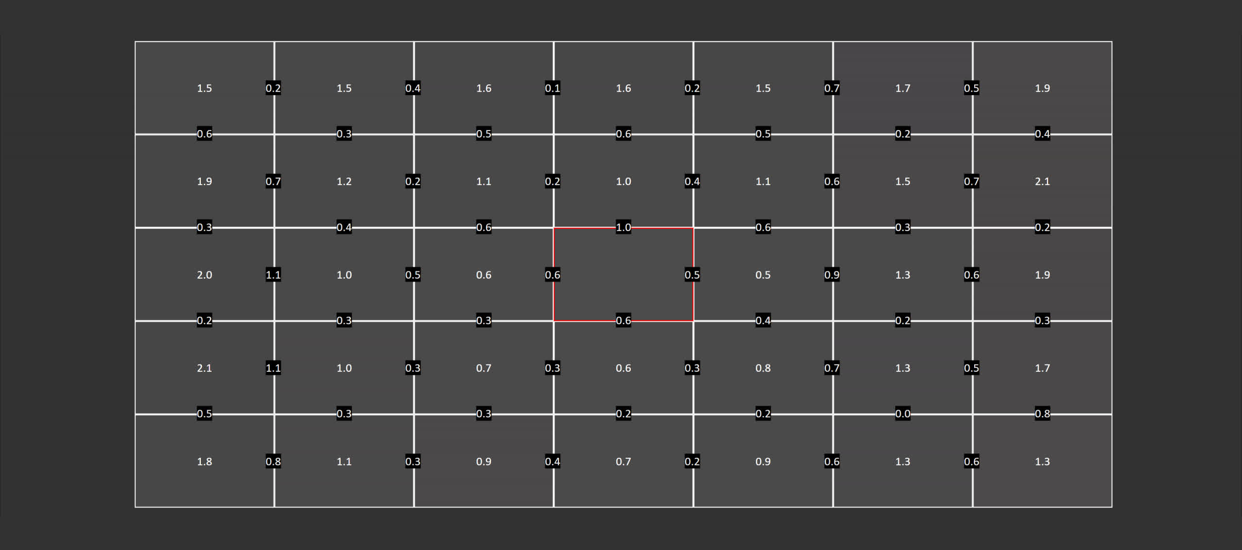
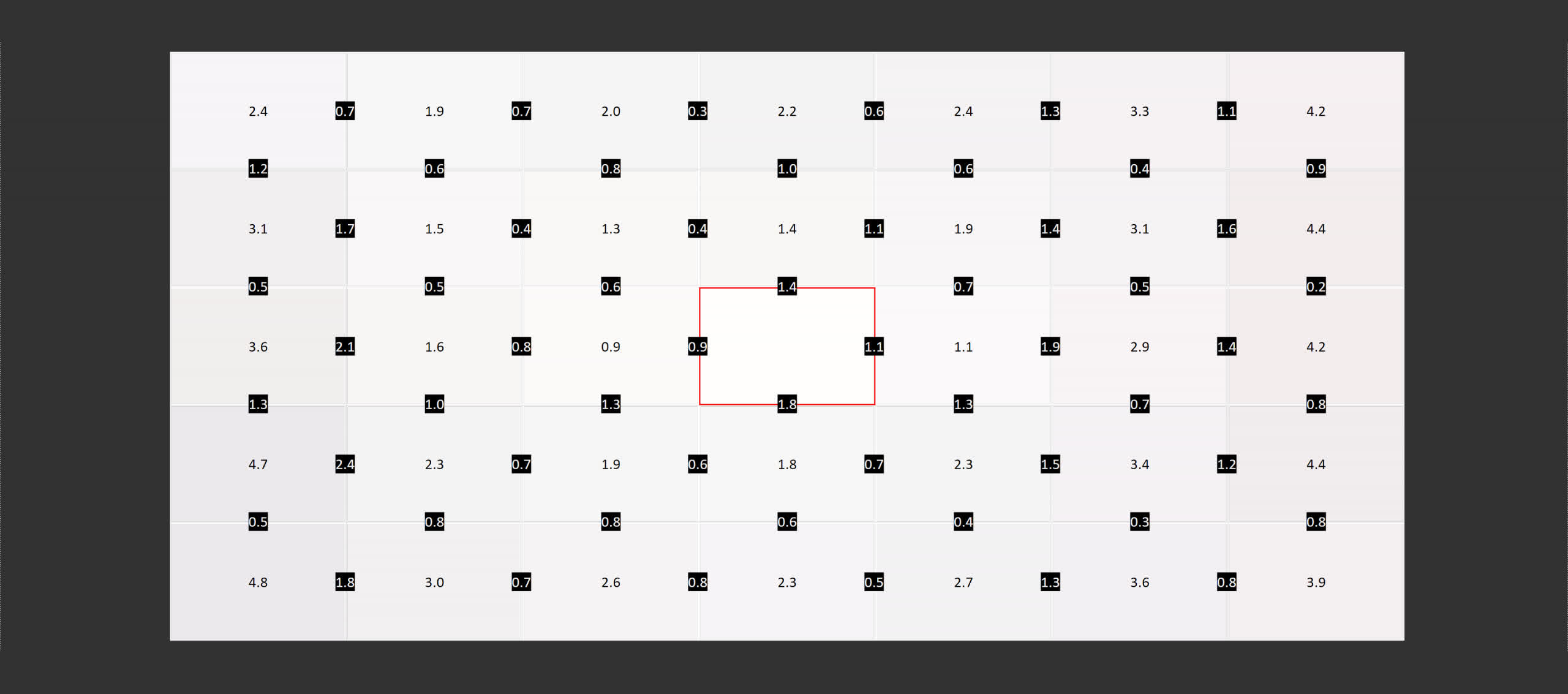
With LG IPS panels there is always some discussion on contrast ratio, especially since the early days of monitors like the 27GL850. However since that initial release of Nano IPS displays, LG has been able to improve the contrast ratio with newer panels. While the AW2721D doesn't have a fantastic contrast ratio, easily beaten by VA panels, I recorded roughly a 1000:1 result which is on par for a modern IPS monitor. Viewing angles are outstanding, and LG panels remain some of the best on the market in this area. There’s very little color shift when viewing at off angles which gives you the flexibility to view this display in different ways. I was also generally pleased with uniformity, although there was some fall off along the outer edges. The central zone was great but my unit did exhibit some IPS glow in the bottom right corners, although your mileage may vary and I suspect this will improve on my sample over time. Wrapping up our performance testing is a look at HDR. The AW2721D, despite being G-Sync Ultimate, is only a semi-HDR panel. Of the three pillars of HDR, what this monitor lacks is proper local dimming; we're getting only 32 edge lit zones, which is insufficient for producing bright highlights and deep blacks on screen at the same time, a cornerstone of an HDR presentation. In practice there is significant haloing, extending from the edges of the monitor to any bright objects, and this can be distracting and worse than no local dimming at all depending on the content.
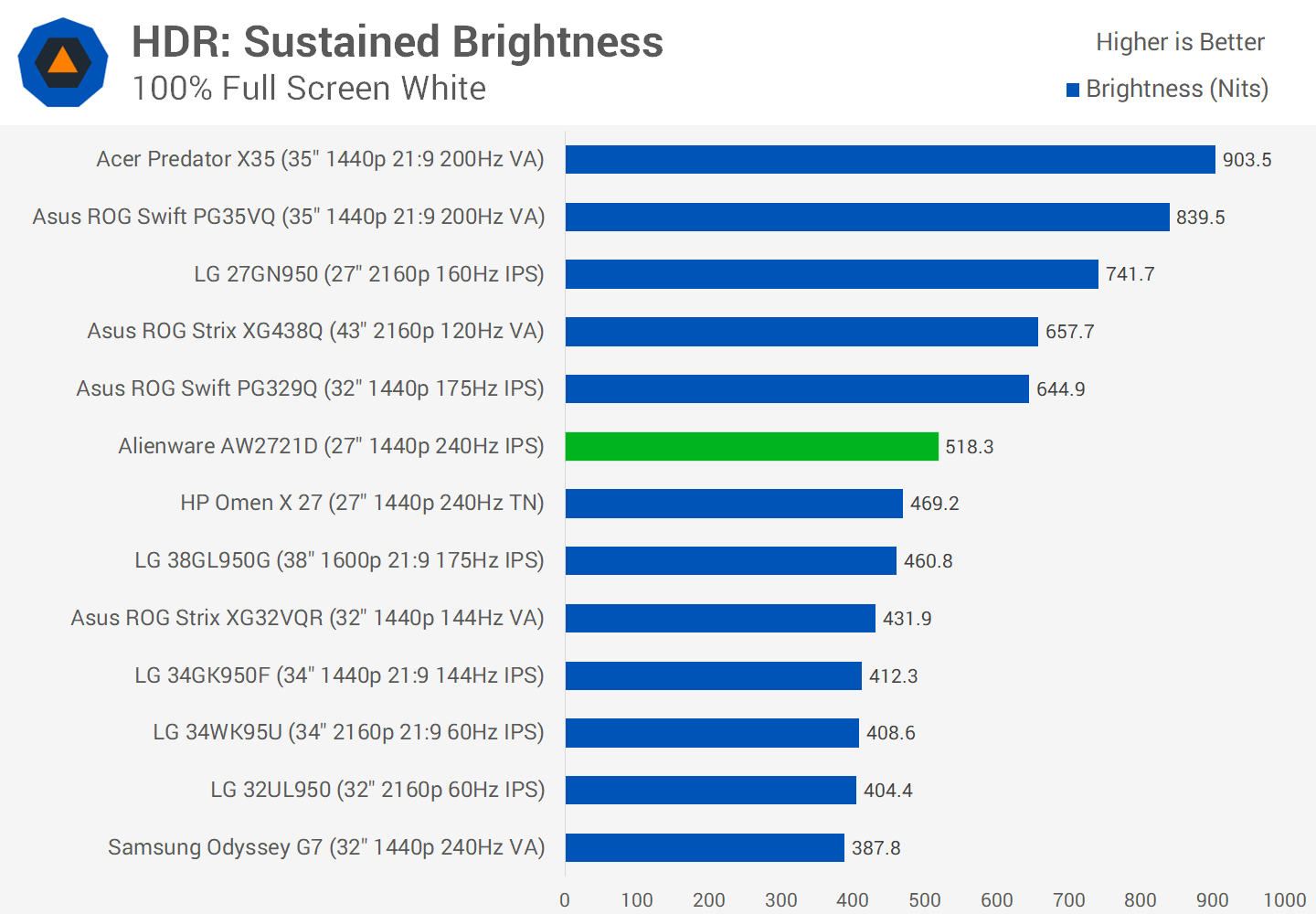
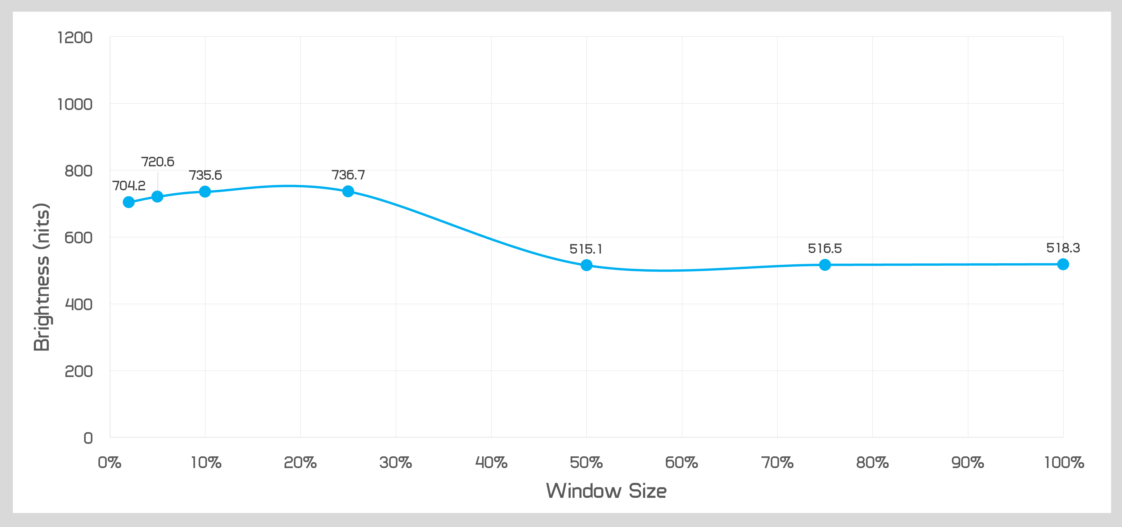
What the AW2721D gets right is brightness. Sustained brightness of around 520 nits with a full white window is decent, and that increases to 750 nits for bright flashes, enough to dazzle in indoor conditions. The display can also sustain over 700 nits for lower window sizes, adding to a decent but not chart topping collection of brightness numbers.
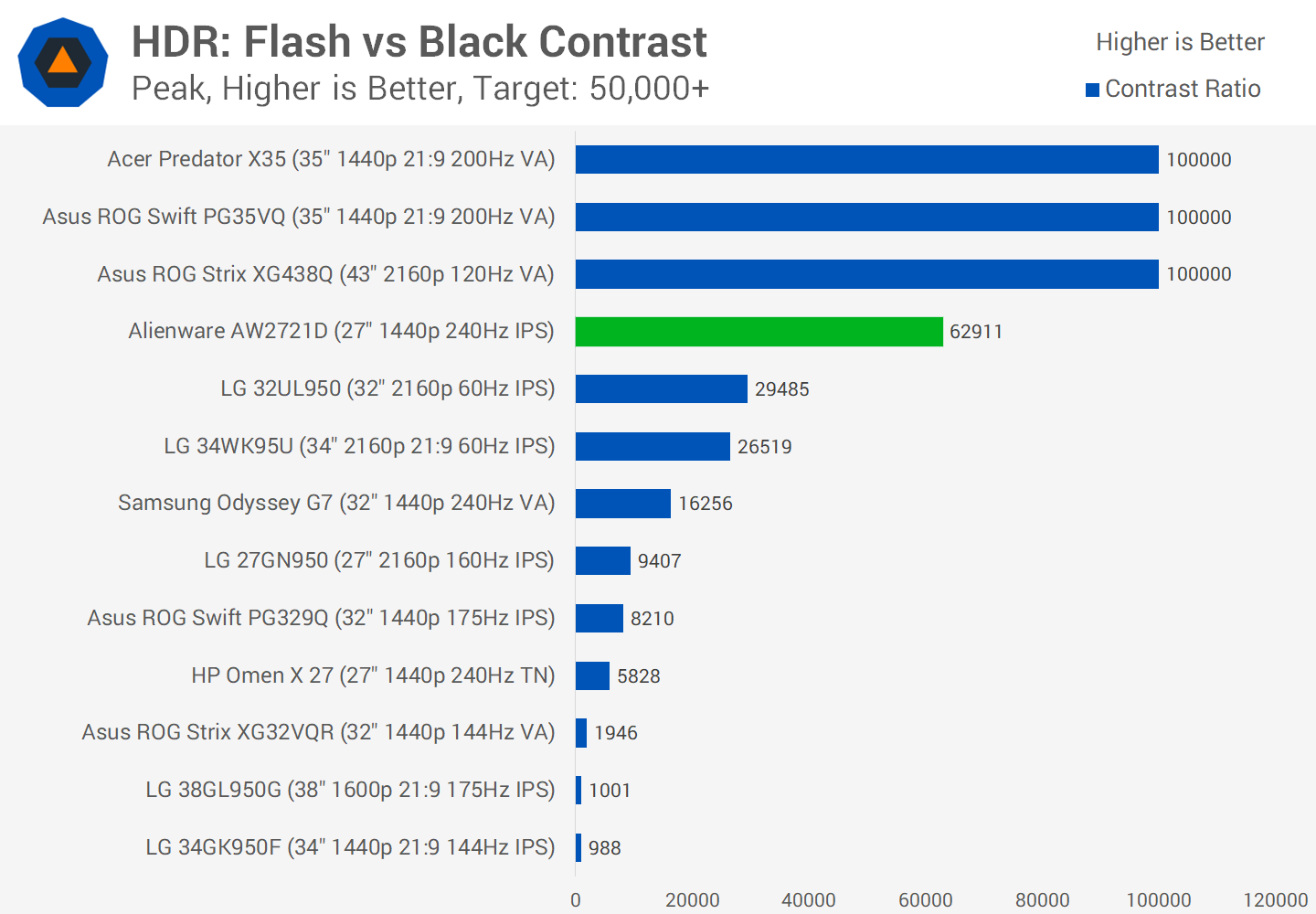
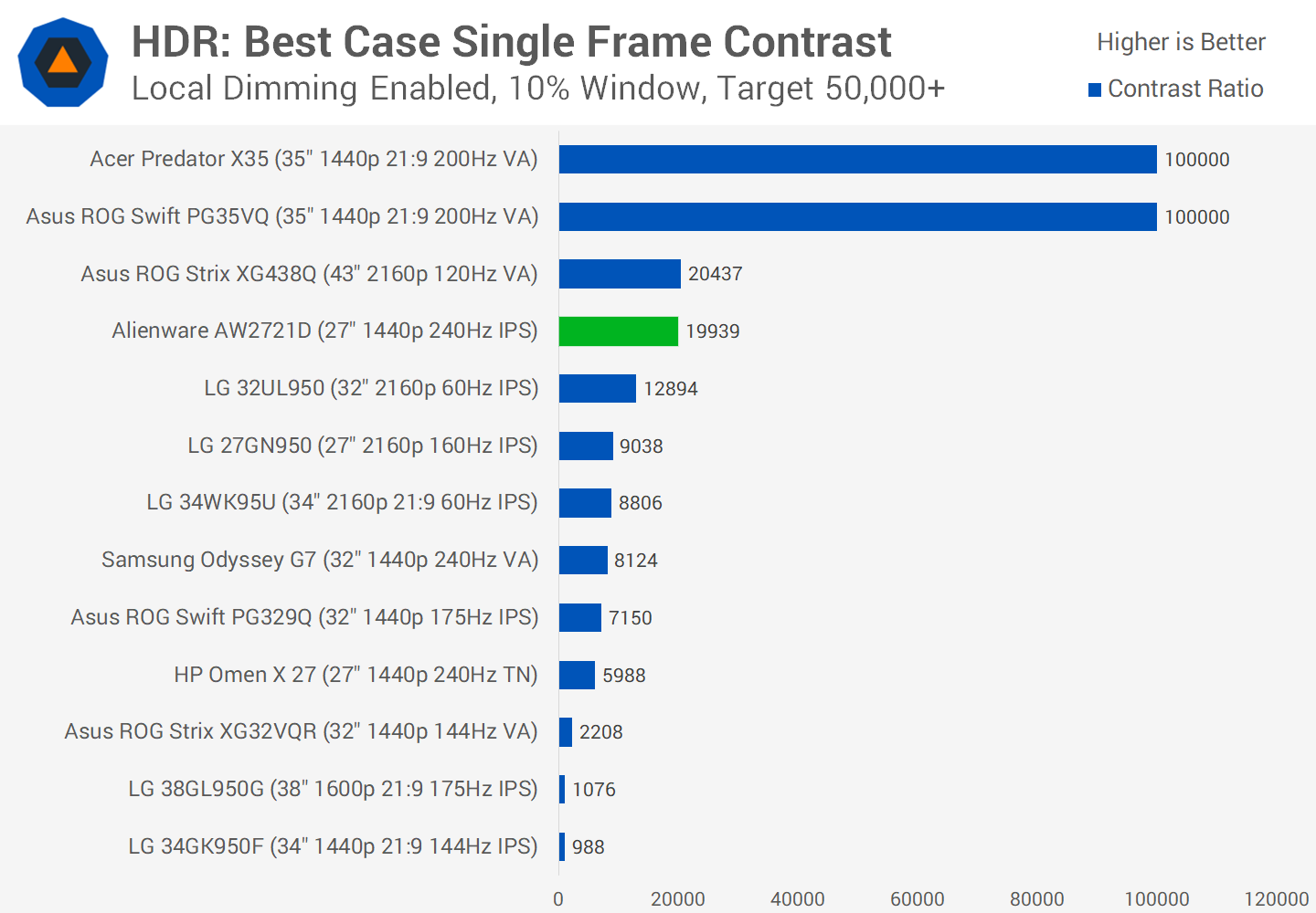
In a best case scenario, the AW2721D can change from dark to bright in separate frames to good effect, delivering a dynamic contrast ratio as high as 63,000:1. However when measuring within a single frame, the AW2721D in even the best case scenario fails to reach a baseline target contrast ratio of 50,000:1 for an okay HDR experience. This is with a bright and dark object far away on the screen.
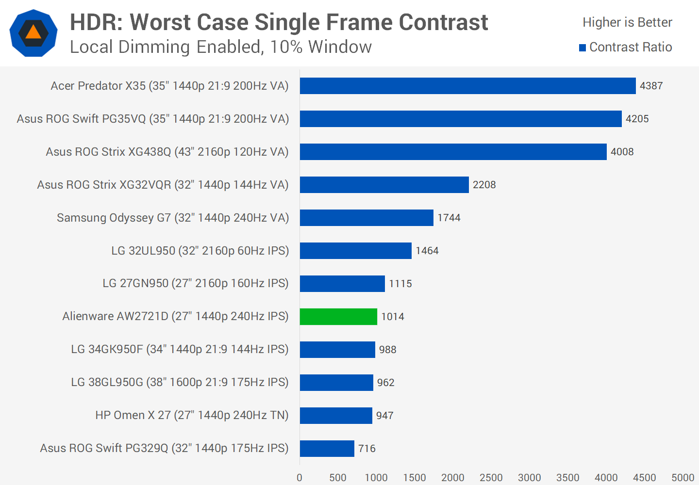
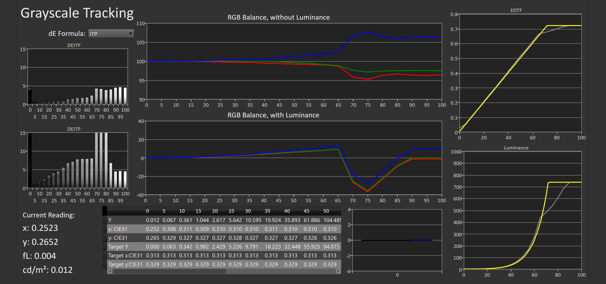
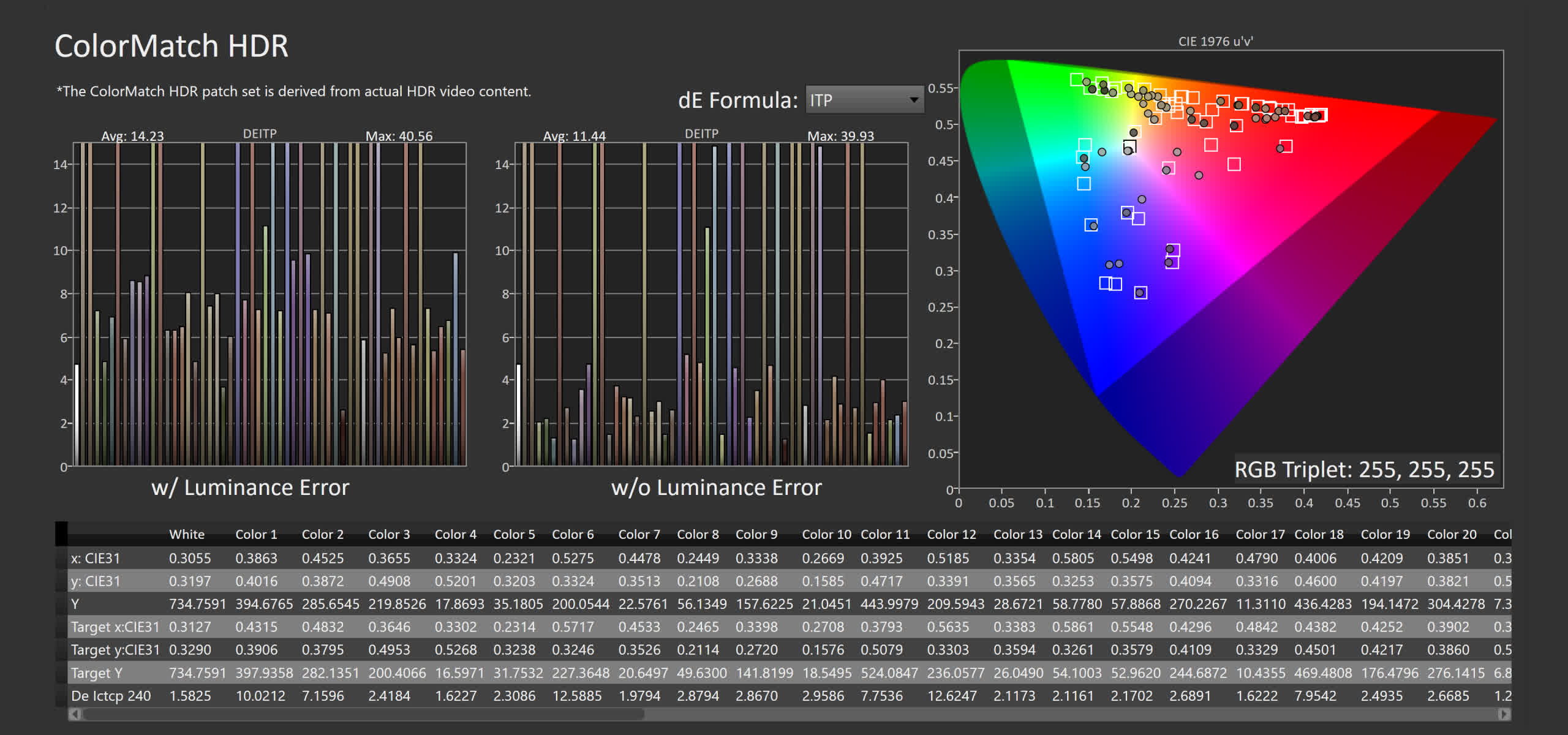
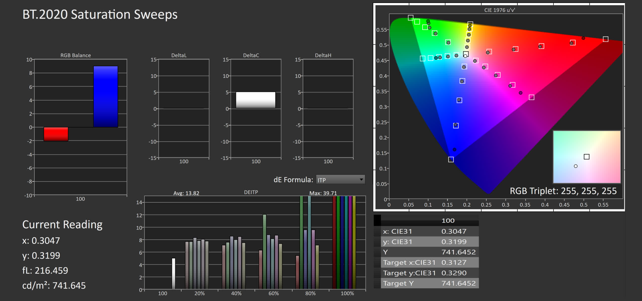
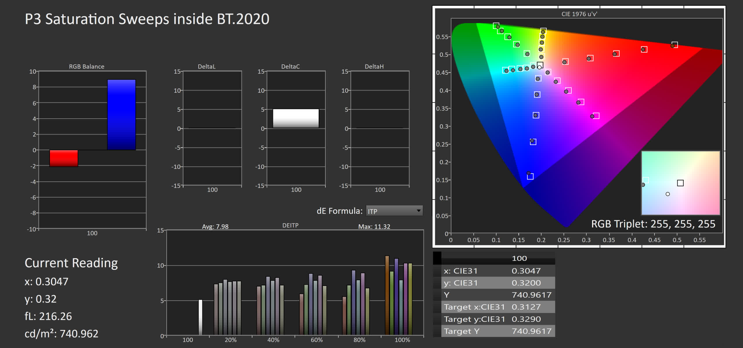
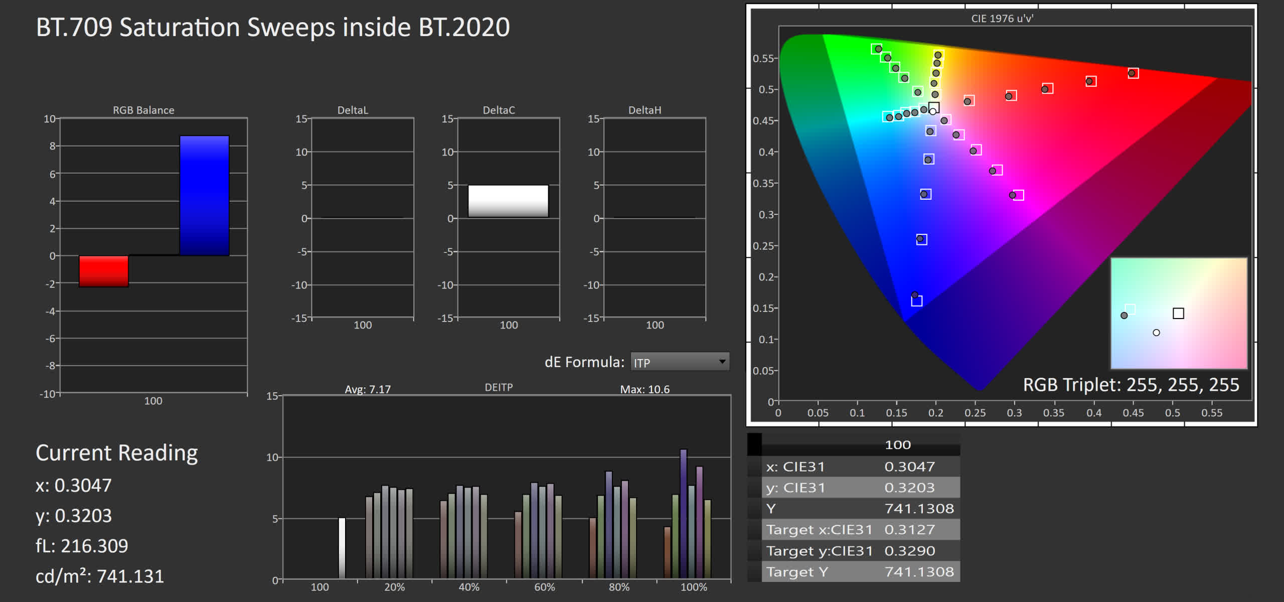
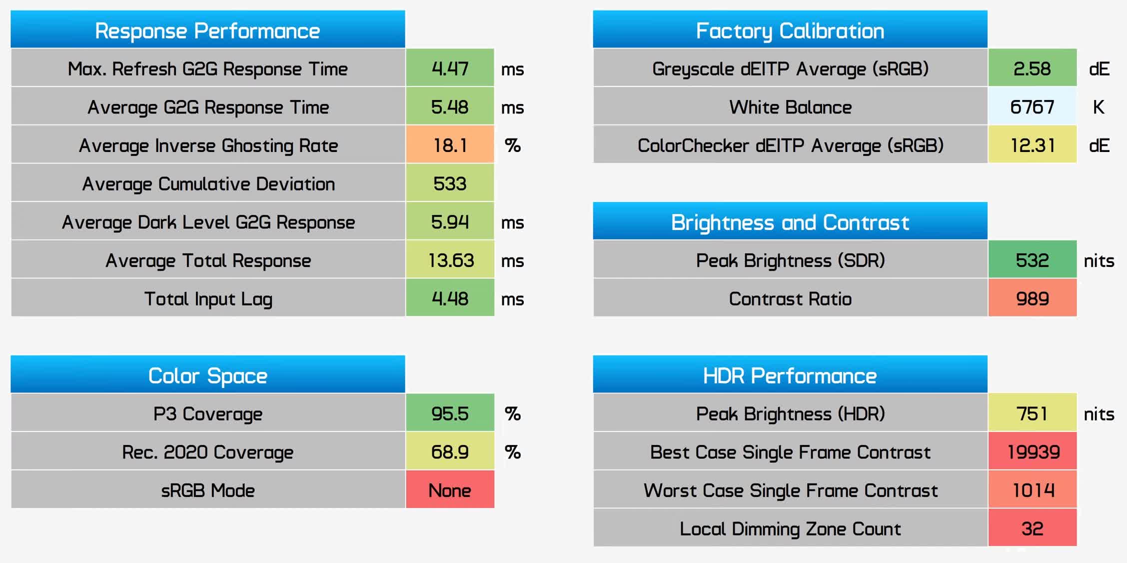
And in our worst case single frame contrast test, which measures a bright and dark object side by side, the AW2721D does not deliver an HDR experience. This is because edge lit local dimming can not sufficiently dim the screen for HDR content, so within each column zone you fall back to the display's native contrast ratio. If a panel cannot improve upon its SDR numbers in this test, it's not delivering a true HDR experience. In terms of HDR accuracy, the display is also a mixed bag. This monitor doesn't handle brightness roll off well, so elements that should be bright are not as bright as they should be. For some reason, RGB balance also gets a lot colder at higher brightness levels, while it's decent and quite accurate at lower brightness levels. However in the HDR mode, the AW2721D doesn't do the worst job of keeping to proper saturation performance within the limits of what the display can do. Particularly when viewing P3 and Rec.709 sweeps inside BT.2020, the results were better than I expected, so saturation tends to be quite well held in this mode and this should deliver a good color experience. Who Is It For?The Alienware AW2721D is a great high-end gaming monitor and one that shows the promise of IPS technology for 1440p 240Hz applications. Thanks to advancements made in the last few years, IPS is definitely fast enough for these sorts of refresh rates, and while this particular monitor doesn't set any new performance records, it was consistently near the top of our response time charts which is what buyers forking out over $800 on a new monitor will be after. I was quite impressed with this display's versatility. With features like 96% P3 coverage, excellent factory greyscale calibration, and a nice flat panel with excellent viewing angles, the AW2721D is suitable for creative and general office work, too. If you want a single monitor in your setup to tackle both high-end gaming and productivity, then something like the AW2721D is going to set you up perfectly now and for many years into the future. After all, hitting 1440p at 240 FPS in today's games is quite a challenge. There are several other little bonuses sprinkled in here as well. Variable overdrive keeps performance solid across the refresh range, leading to a coveted single overdrive mode experience. Input lag is virtually zero, and the build quality was impressive and befitting of its price tag. While on the whole this is a great display and I'm very positive about the results, there are some oversights. Not having an sRGB emulation mode in such a high-end product is a noteworthy omission. The use of an LG IPS panel prevents us from getting backlight strobing for added motion clarity. And despite being a G-Sync Ultimate display, the HDR performance on offer is poor due as we're only getting edge lit local dimming. You can see how it stacks up here in our performance summary chart, new for this review and something we might use going forward. A couple of weaknesses shown in red but on the whole, a lot of green results indicating this monitor performs above average compared to all the other displays we've tested so far. Alienware AW2721D Performance Summary
As for whether you should buy the AW2721D, I'm sure a lot of people are wondering whether to get this, or go for something like the Samsung Odyssey G7, so here's my simple breakdown as I've tested both. If you're after just a pure gaming monitor, the Odyssey G7 is probably going to be the better option. It's cheaper, especially at 27″, and features better response time results. It also has the benefit of twice the contrast ratio, and includes backlight strobing which is a feature that many people desire for its motion clarity benefits. However the Odyssey G7 is only a gaming display. The AW2721D with its IPS panel is much more versatile and I'd recommend it for those that also want to use their monitor for other things. The Alienware’s flat panel is also much better at this size, plus you're getting better viewing angles, better uniformity, a wider color gamut and better factory calibration. All of these elements combined with response time numbers that aren't too far off the Odyssey, means it's a great balance of features. At this price, there are a couple of other options, like going 4K 144Hz with a monitor like the LG 27GN950. But for today's gaming, I'd swing more towards the AW2721D especially as the 27GN950 lacks HDMI 2.1. High-end ultrawides may also come into consideration although at that point we're basically talking about a different monitor category. Shopping Shortcuts: |
| How to Transfer Your iCloud Photo Library to Google Photos Posted: 04 Mar 2021 12:13 PM PST  There are many cloud storage services available today, and Apple and Google offer two of the more popular options. Switching can feel like a daunting task, but Apple makes it easy to move your iCloud library to Google Photos. Apple's transfer service can bring a copy of your iCloud photos and videos over to your Google Photos account. There are some things that can't be transferred, however. They include shared albums, smart albums, stream content, live photos, and some metadata. RELATED: Google Photos Loses Its Free Storage: What You Need to Know The setup process is simple, but the actual transfer can take up to a week if you have a particularly large library. Let's get started. First, head to privacy.apple.com in a web browser such as Safari or Google Chrome. Sign in with your Apple ID.
Click "Continue" to accept the Apple ID & Privacy statement.
Next, select the "Request to Transfer a Copy of Your Data" link.
You'll see details about how much of your library can be transferred. Underneath that, select the drop-down menu and pick "Google Photos" as the destination.
You can now select which content you'd like to transfer and then "Continue." Your choices include photos and videos.
The next screen will explain that if your Google account doesn't have enough space, not all of the items will be copied. Click "Continue" to proceed.
A new window will open for you to sign in to or choose your Google account.
Click "Allow" from the pop-up message to give Apple permission to add photos and videos to your Google Photos library.
Select "Allow" again on the next screen to confirm your choices.
Lastly, Apple explains that the process will take between three to seven days. When the transfer is complete, you will be notified through your Apple ID email. Click "Confirm Transfers" to finish up.
That's all there is to it! Keep an eye out for the email when the transfer is done. A copy of your iCloud photos and videos will now appear in Google Photos. |
| What Are Android Notification Channels? Posted: 04 Mar 2021 11:00 AM PST
Notifications have been a major part of Android since the beginning. They can be both a blessing and a curse, though. To help you fine-tune your experience, Android has a feature called "Notification Channels." They make notifications a lot better. As smartphones and apps have evolved, so have notifications. In the early days, notification controls were pretty basic. You'd install an app and you could turn notifications on or off. As apps got more complex, so did the notifications. RELATED: How to Pause Notifications on Android Maybe you only want notifications for one specific thing from an app. Some apps have built-in granular notification controls, but not all of them do. And you'd also have to dig through that app's settings, which might be organized in an unfamiliar way. Notification Channels aim to simplify this process and give more control to the users. What Are Notification Channels on Android?"Notification Channels" were introduced in 2017 with Android 8.0 Oreo. The idea is that apps can group different types of notifications into "channels." Each channel can then be turned on or off by the user. This all happens in the Android settings. Let's take a look at YouTube, for example. There are quite a few channels available. You have "Subscriptions," "Livestreams," and "Comments and Replies," to name a few. If you only want to know about new videos from your subscriptions, you can turn off everything else.  Since all of these notification options are in the Android settings, the process is the same for every app. You don't have to find where YouTube buries its notification settings, then go and hunt down the settings in another app, which could put them in a completely different spot. The other big benefit of Notification Channels is the ability to adjust things as they come in. Say you get a YouTube notification for a live stream and you realize you don't want to be notified about that. You can disable the "Livestreams" channel right then and there. Think of it like putting a nozzle on a water hose. Instead of only being able to choose between "On" or "Off," you have a lot more fine controls. Turn off Notification Channels from the Android SettingsThere are two ways that you can adjust Notification Channels. The first method is proactive, while the second one takes action on notifications as they come in. For the first method, swipe down from the top of your device's screen (once or twice, depending on your phone or tablet's manufacturer) and tap the gear icon to open the Settings menu.
Next, select "Apps & Notifications."
Tap "See All [Number] Apps" for the full list of installed apps.
Find the app that you would like to adjust the Notification Channels for.
Now, select "Notifications."
At the top, you still get the option to turn all notifications on or off.
Underneath that is the list of Notification Channels. Depending on the app, there may be a huge number of channels or none at all. Toggle on or off any of the channels you'd like.
In addition, you can customize how these notifications present themselves. First, tap on the Notifical Channel name.
Here, you can decide whether you want notifications from this channel to ring or vibrate your phone, be silent, or pop up on the screen.
Turn off a Notification Channel from a NotificationFor the second method, you need to get a notification. Once you have one, tap and hold it until settings appear.
Now, select "Turn Off Notifications."
A menu will open and highlight the Notification Channel associated with the notification you just received. Toggle off the switch.
Tap "Done" when you're finished.
That's it! Notification Channels make it possible to really dial in how you want notifications to work on your Android smartphone or tablet. It's a great trick to know if you find yourself getting annoyed by notifications. |
| How to Cancel Your Paramount+ Subscription Posted: 04 Mar 2021 09:29 AM PST  Paramount+ is the successor to CBS All Access and is the home of movies and TV shows produced by Paramount Studios. But if you're not enjoying the streaming platform, here's how to cancel your Paramount+ subscription.
RELATED: What is Paramount+, and Does It Replace CBS All Access? When you're ready to cancel your Paramount+ subscription, open the Paramount+ website in your desktop web browser of choice on your Windows 10 PC, Mac, or Linux computer. If necessary, log in to your account by clicking the "Sign In" button found in the top-right corner of the site and then enter your account credentials.
Next, ensuring that you're in the account owner's profile (likely your own), select your avatar in the top-right corner of the streaming service's website.
Click the "Account" option from the drop-down menu.
From the "Subscription & Billing" section, locate the "Subscription" listing and select the "Cancel Subscription" link.
Paramount+ will now double-check that you actually want to cancel your subscription. After checking the box certifying that you understand the company's terms of cancellation, click the "Yes, Cancel" button.
Your Paramount+ subscription is now canceled. You will continue to have access to the streaming platform through the end of your current billing cycle. |
| You are subscribed to email updates from My Blog. To stop receiving these emails, you may unsubscribe now. | Email delivery powered by Google |
| Google, 1600 Amphitheatre Parkway, Mountain View, CA 94043, United States | |

0 nhận xét:
Đăng nhận xét